Skip to content
Real Cost Report
  • Legal
  • Insurance
  • Mortgage
  • Loans
  • Investing
  • Healthcare
  • Business
  • Estate Planning
Real Cost Report
Real Cost Report
  • Legal
  • Insurance
  • Mortgage
  • Loans
  • Investing
  • Healthcare
  • Business
  • Estate Planning

Investing Strategy

Index funds vs active management, portfolio allocation, and long-term return data in 2026. Expense ratio comparison across major brokerages.
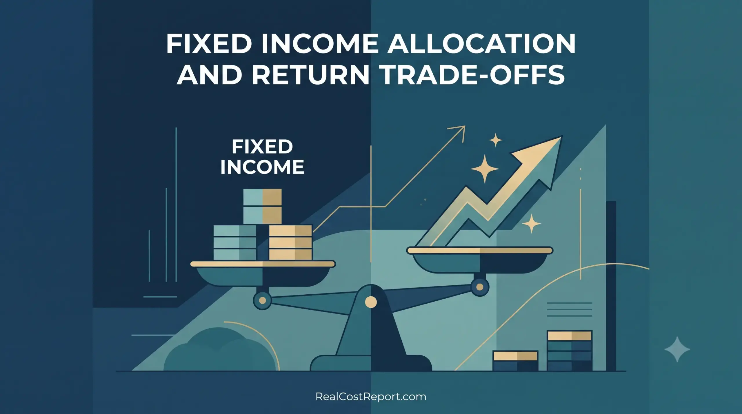
A balanced scale weighing coins against an arrow, illustrating fixed income allocation and return trade-offs.

Fixed Income Allocation in 2026: How Much Bond Exposure Is Worth It vs. Stocks?

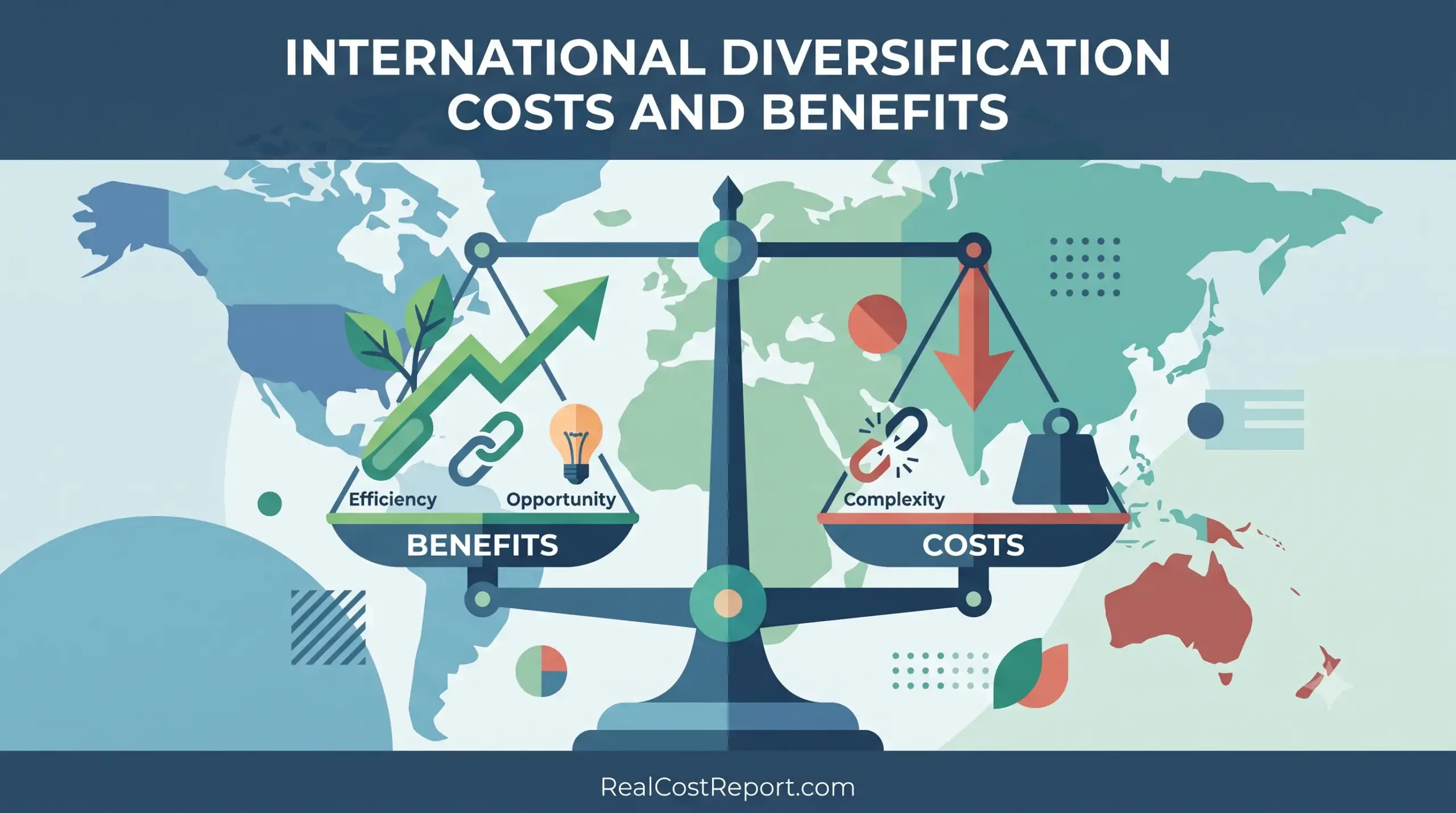
A minimal vector illustration featuring a world map and a large scale comparing the benefits and costs of international diversification.

International Diversification in 2026: What It Really Costs and Whether It’s Worth It

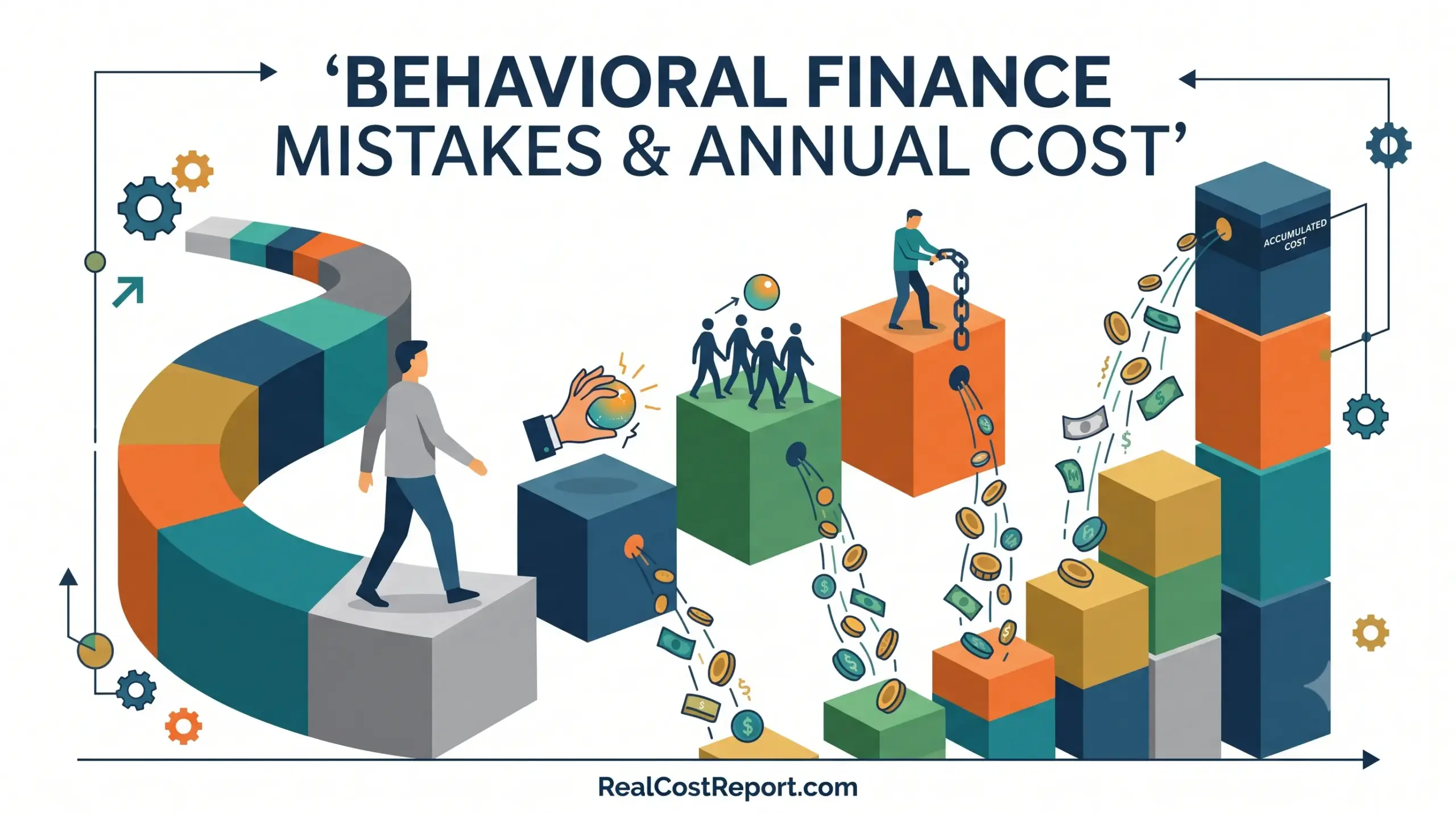
A modern geometric illustration visualizing behavioural finance pitfalls leading to accumulating annual costs along a winding investment path.

Behavioral Finance Mistakes: What They Really Cost You Per Year (2026 Guide)

Geometric illustration of gears, an upward arrow, and a star below the headline Target-Date Fund Costs.

Target-Date Fund Costs in 2026: Is the Convenience Worth It? (Vanguard vs. Fidelity vs. Schwab)

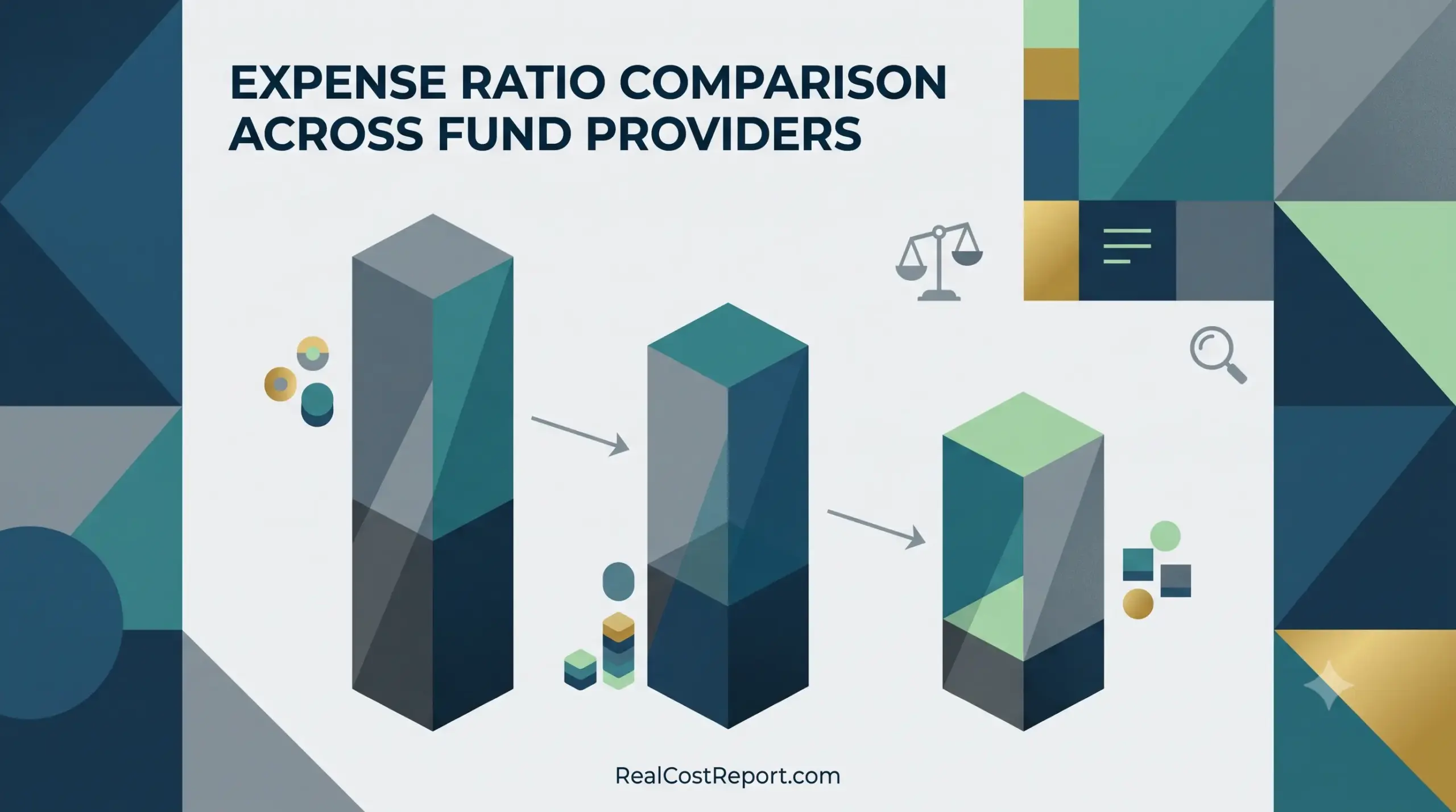
Minimal geometric illustration showing abstract block comparisons representing fund expense ratios, featuring the article title and website URL.

Expense Ratio Comparison Across Fund Providers: Vanguard vs Fidelity vs Schwab (2026)

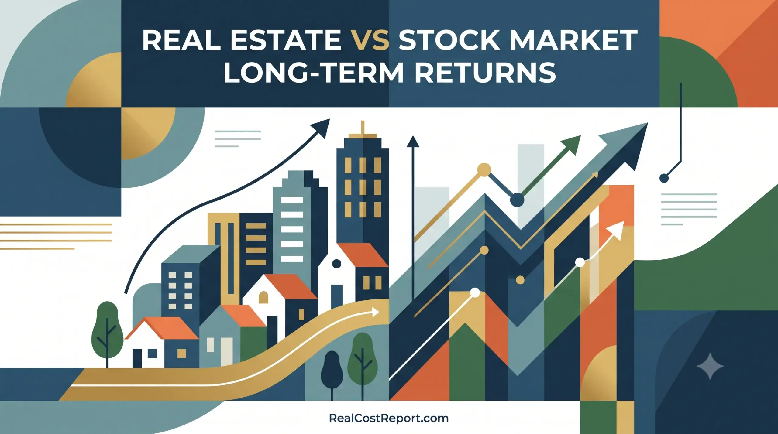
A geometric vector illustration contrasting rising real estate values on the left with a bull market stock chart on the right.

Real Estate vs. Stock Market Long-Term Returns (2026): Which Actually Builds More Wealth?

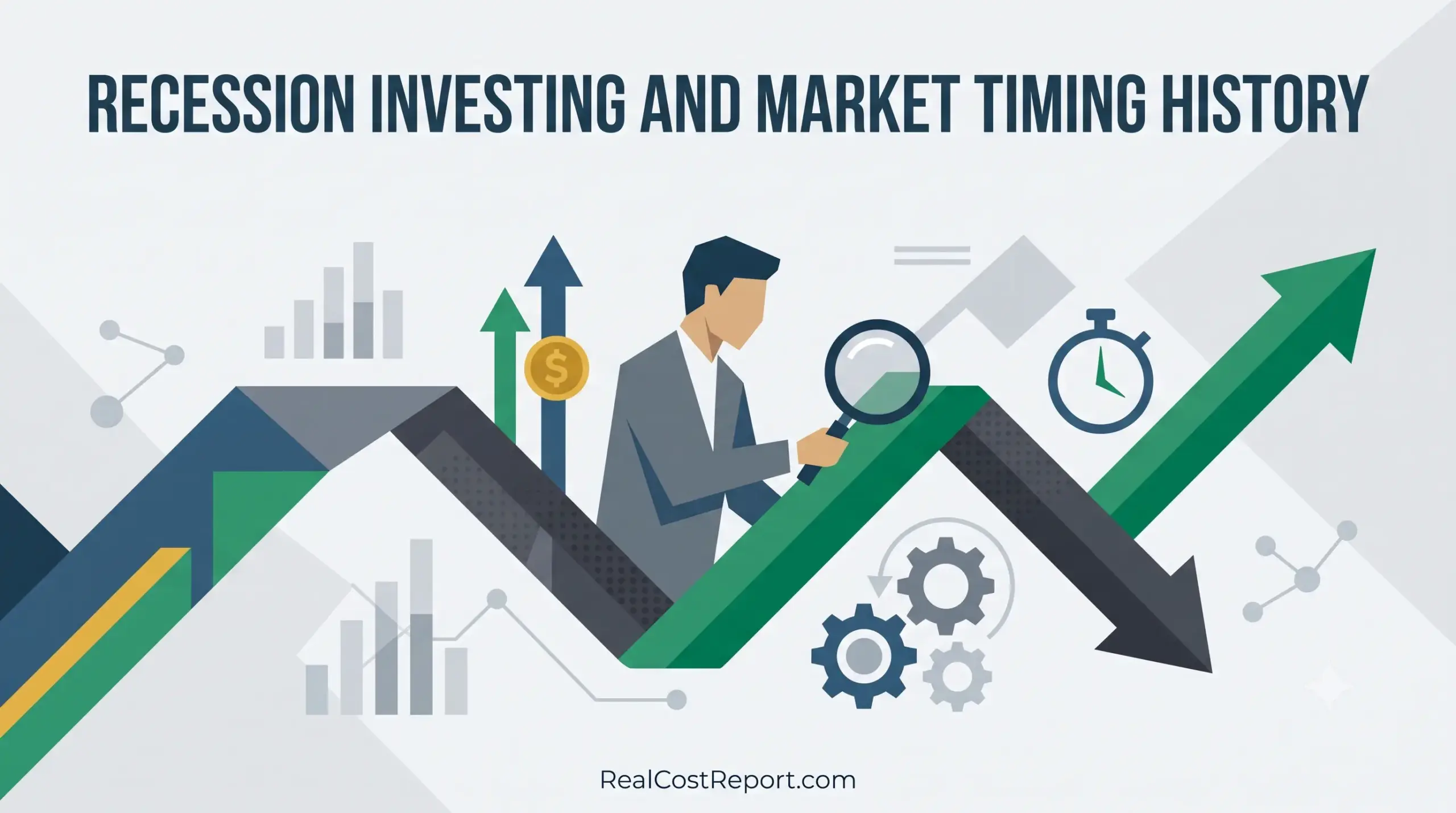
Flat vector illustration of a man with magnifying glass analyzing a fluctuating market arrow with clock and gear icons.

Recession Investing and Market Timing: What 172 Years of History Actually Cost (2026 Guide)

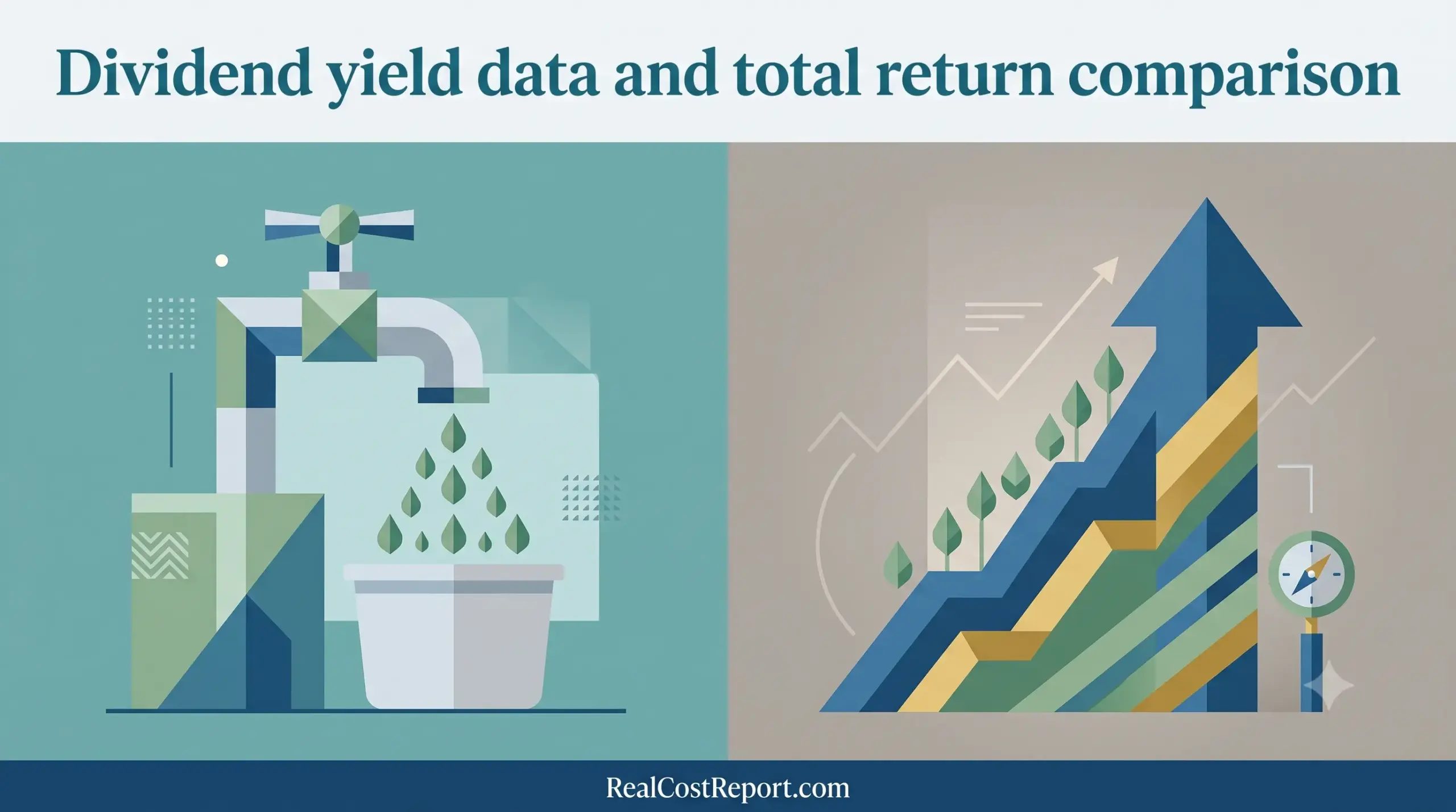
A modern vector illustration dividing two financial concepts: passive income generation and total compound growth with reinvestment.

Dividend Yield vs Total Return 2026: How Much Dividends Really Add to S&P 500 Gains

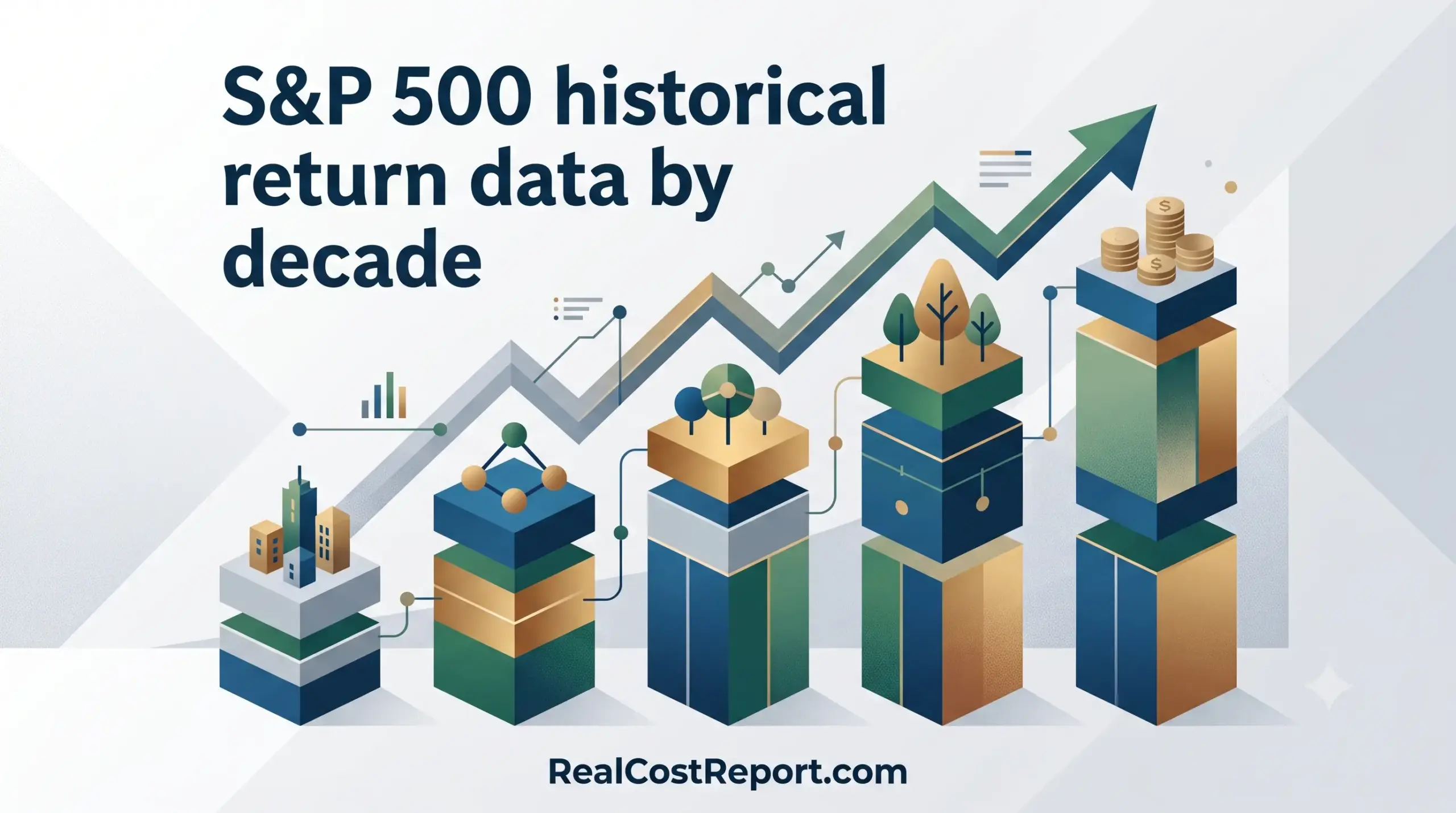
A geometric vector illustration shows an upward-trending bar chart with cities, network nodes, trees, and coins, titled 'S&P 500 historical return data by decade'.

S&P 500 Returns by Decade (2026): Historical Data, Real vs Nominal, and What It Means for Your Portfolio

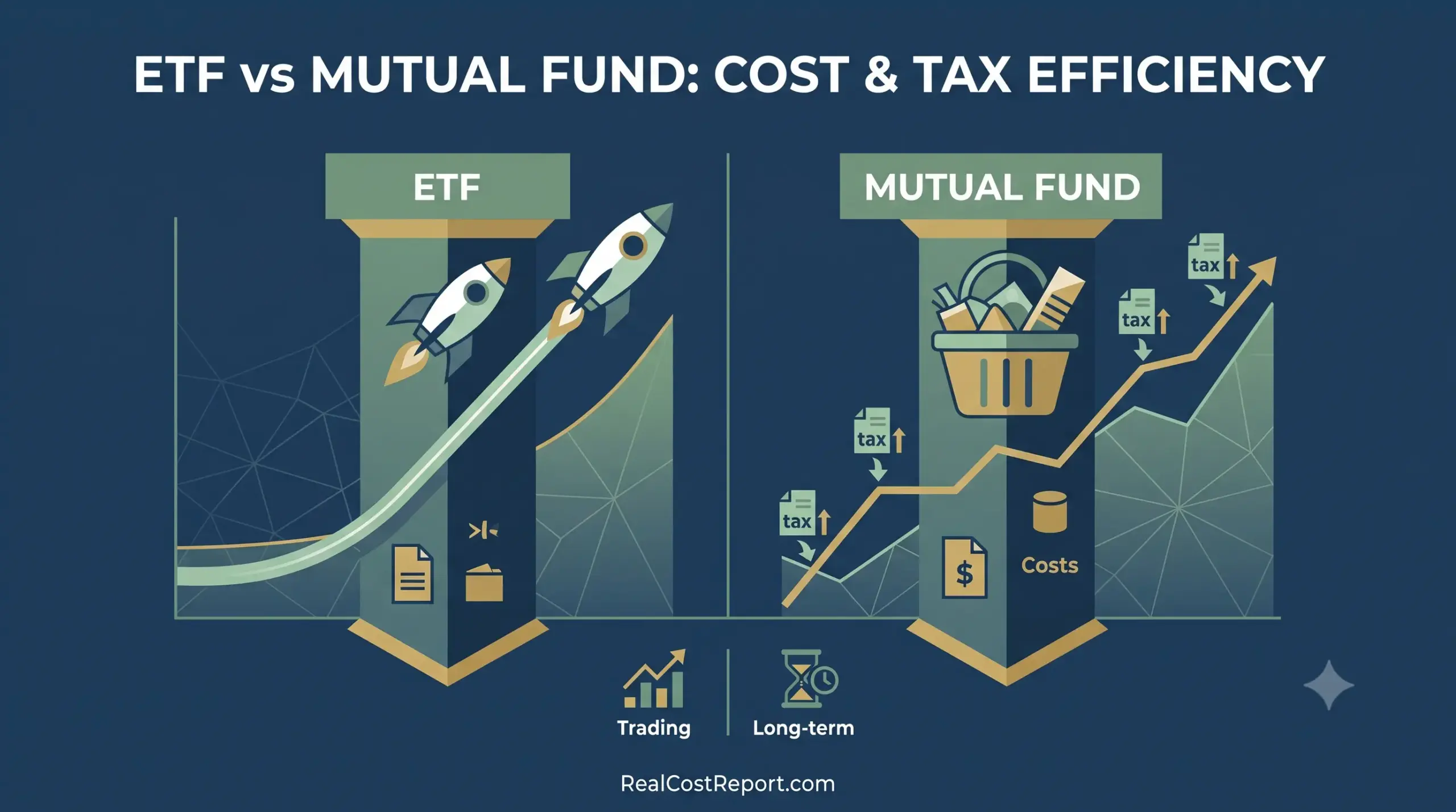
A split geometric vector graphic comparing ETF and mutual fund growth, costs, and tax symbols for analysis.

ETF vs Mutual Fund Cost and Tax Efficiency: 2026 Guide to What You Actually Pay

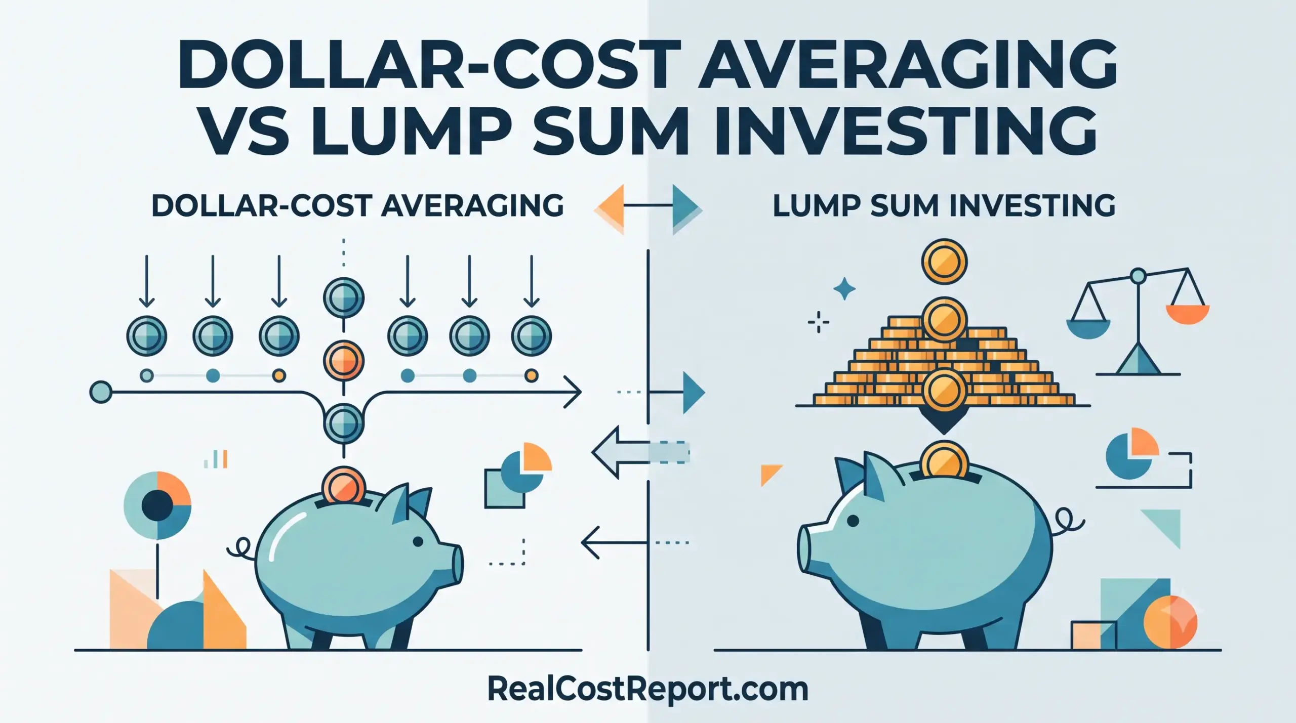
A modern vector illustration comparing a steady stream of investments (DCA) and a single large deposit (Lump Sum) into piggy banks.

Dollar-Cost Averaging vs Lump Sum Investing: Which Wins in 2026?

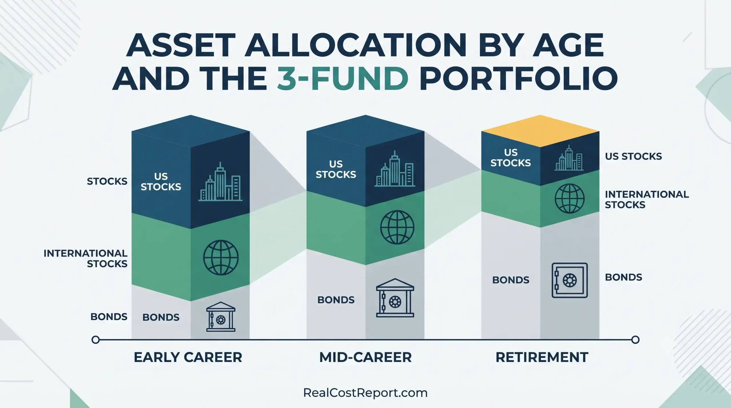
A clean vector diagram showing asset allocation shifting from stocks to bonds through three career stages: Early, Mid, and Retirement.

Asset Allocation by Age and the 3-Fund Portfolio: What It Really Costs in 2026

A modern geometric illustration showing a balance scale with shapes and money, symbolizing financial portfolio rebalancing.

Rebalancing Without Triggering Taxes in 2026: How Much It Actually Costs

A clean geometric vector illustration showing figures pruning branches from a growing money tree, symbolizing the cost of investment fees.

The Long-Term Cost of Investment Fees in 2026: How Much a 1% Advisory Fee Really Costs

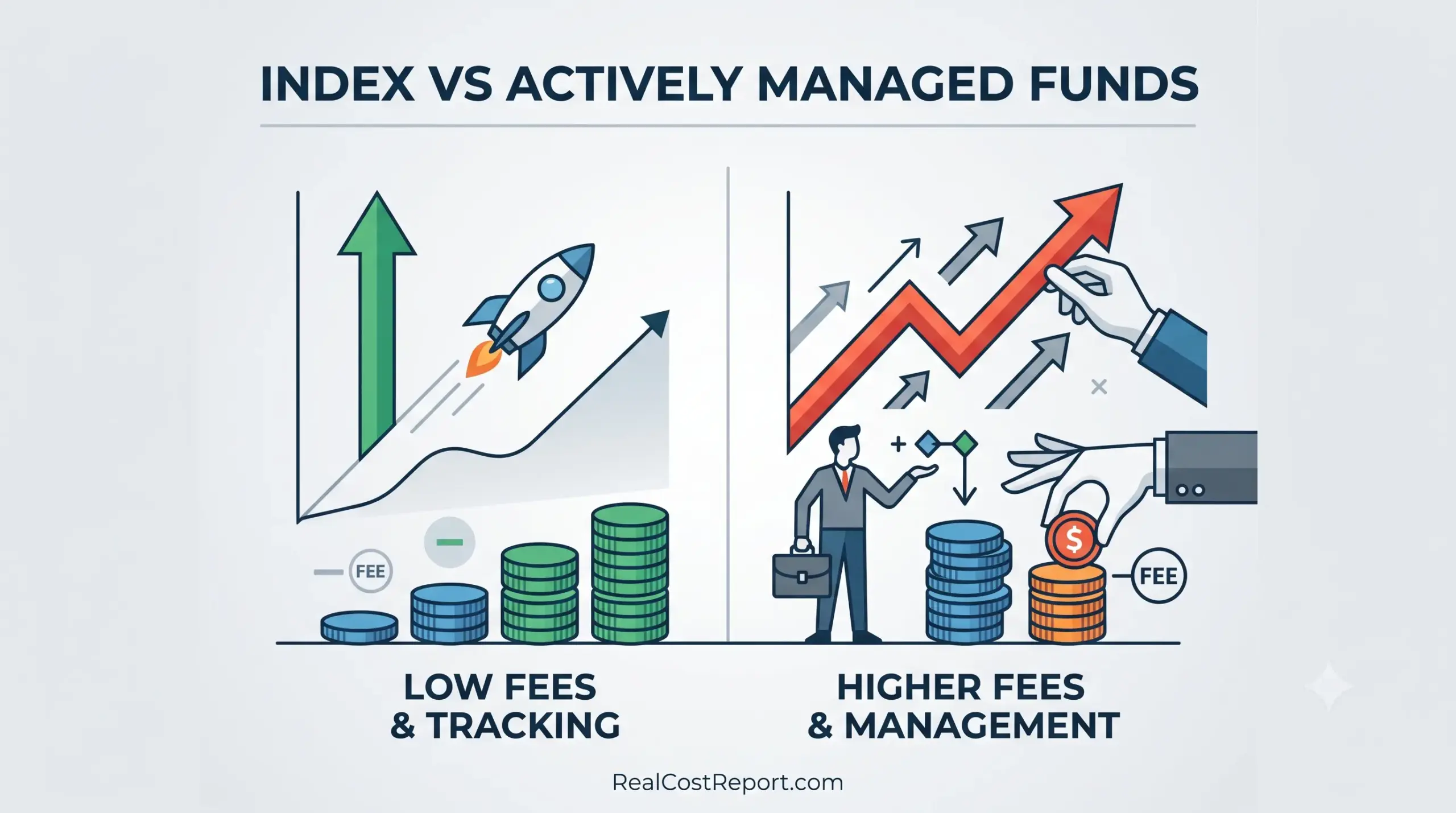
A minimalist vector illustration comparing the performance paths and fee structures of index versus actively managed funds.

Index vs Actively Managed Funds 2026: Fees, Performance, and What It Really Costs

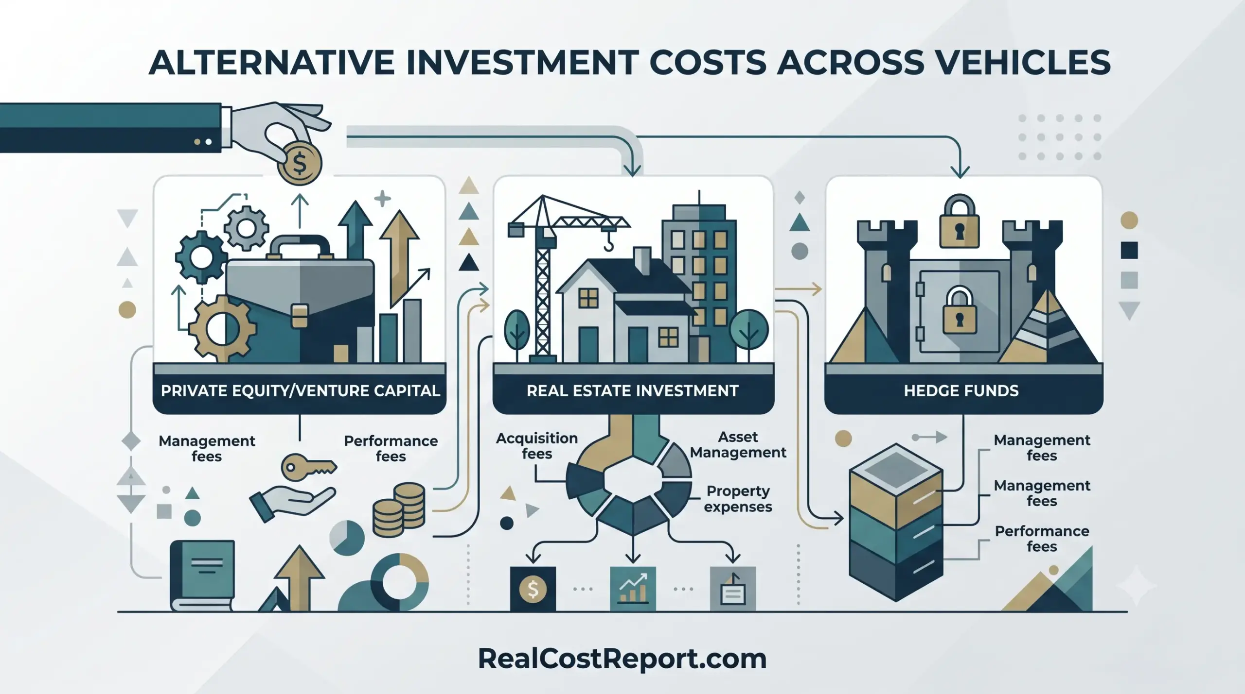
Alternative Investment Costs in 2026: Fee Comparison Across Every Vehicle (PE, Hedge Funds, REITs, Gold & Crypto)

  • About Us
  • Editorial Policy
  • Methodology
  • Privacy Policy
  • Terms of Use
  • Contact Us
© 2026 Real Cost Report. All Rights Reserved.