Skip to content
Real Cost Report
  • Legal
  • Insurance
  • Mortgage
  • Loans
  • Investing
  • Healthcare
  • Business
  • Estate Planning
Real Cost Report
Real Cost Report
  • Legal
  • Insurance
  • Mortgage
  • Loans
  • Investing
  • Healthcare
  • Business
  • Estate Planning

Investing

Compare advisor fees, expense ratios, and retirement account strategies. SEC EDGAR and FINRA BrokerCheck verified data.

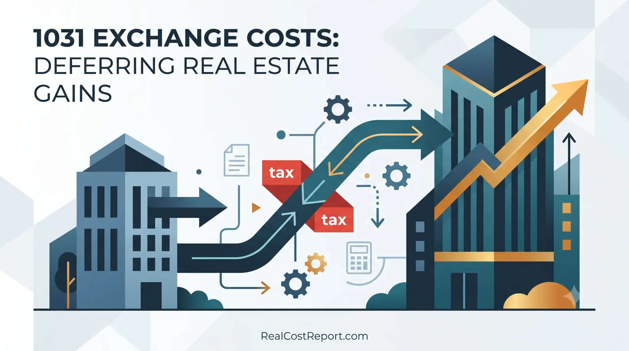
A vector illustration with buildings and arrows, demonstrating the cost process of a 1031 real estate exchange.

1031 Exchange Costs in 2025: What You Pay to Defer Real Estate Gains

Geometric vector graphic for Real Cost Report showing abstract maze and arrows for NIIT surtax avoidance.

NIIT Surtax 2025: How the 3.8% Tax Works and 7 Ways to Avoid It

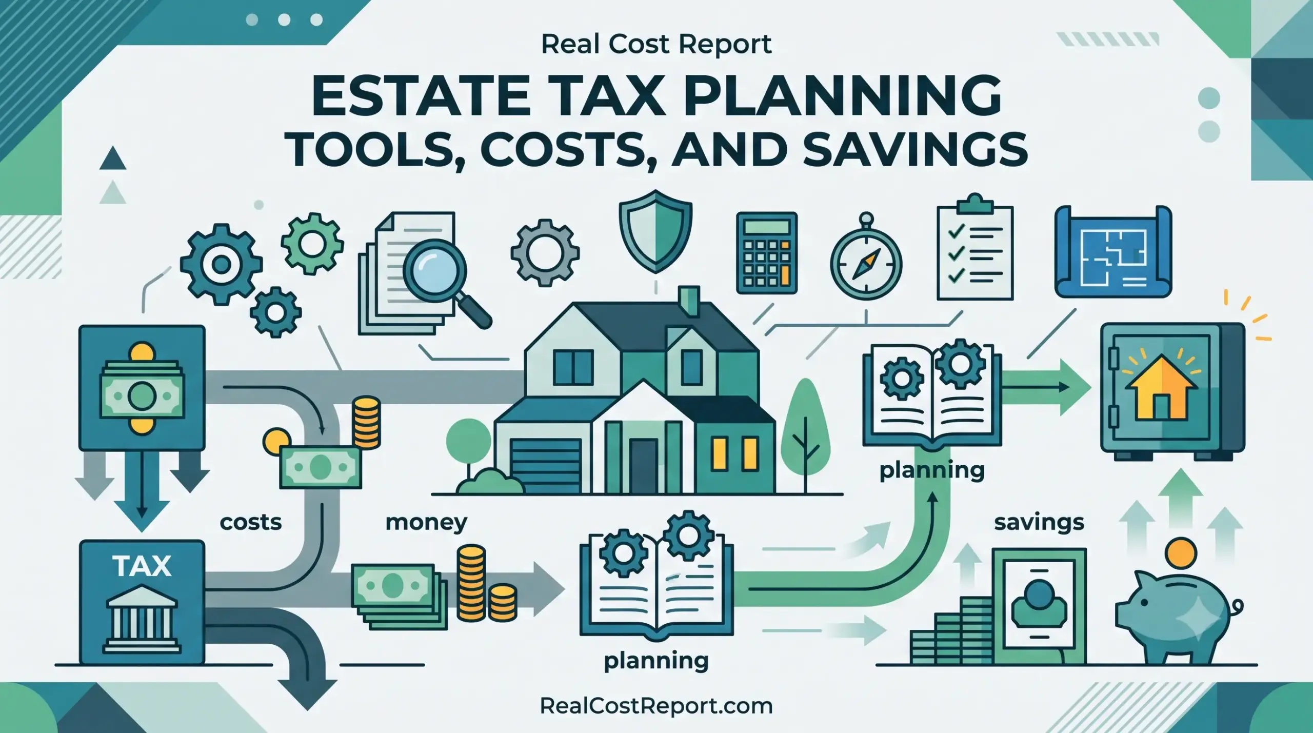
Minimal geometric vector illustration featuring a house, shield, piggy bank, and planning icons for an estate tax guide.

Estate Tax Planning Tools 2026: Costs, Savings & What’s Worth It

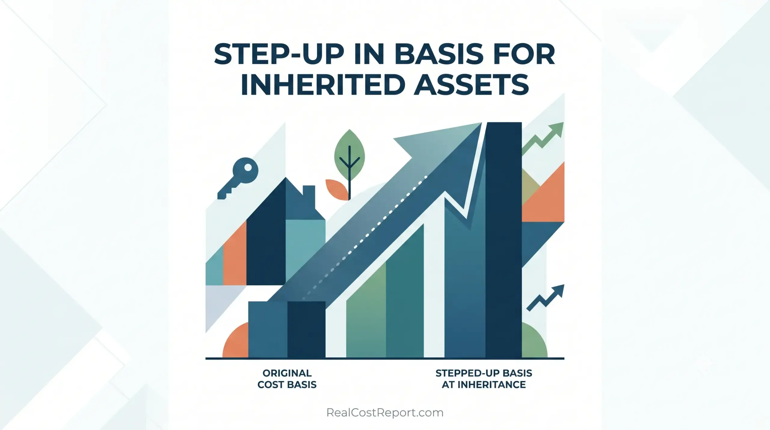
Geometric vector illustration for Real Cost Report showing a bar chart illustrating the step-up in basis for inherited assets.

Step-Up in Basis for Inherited Assets: How Much It Saves Heirs in 2026

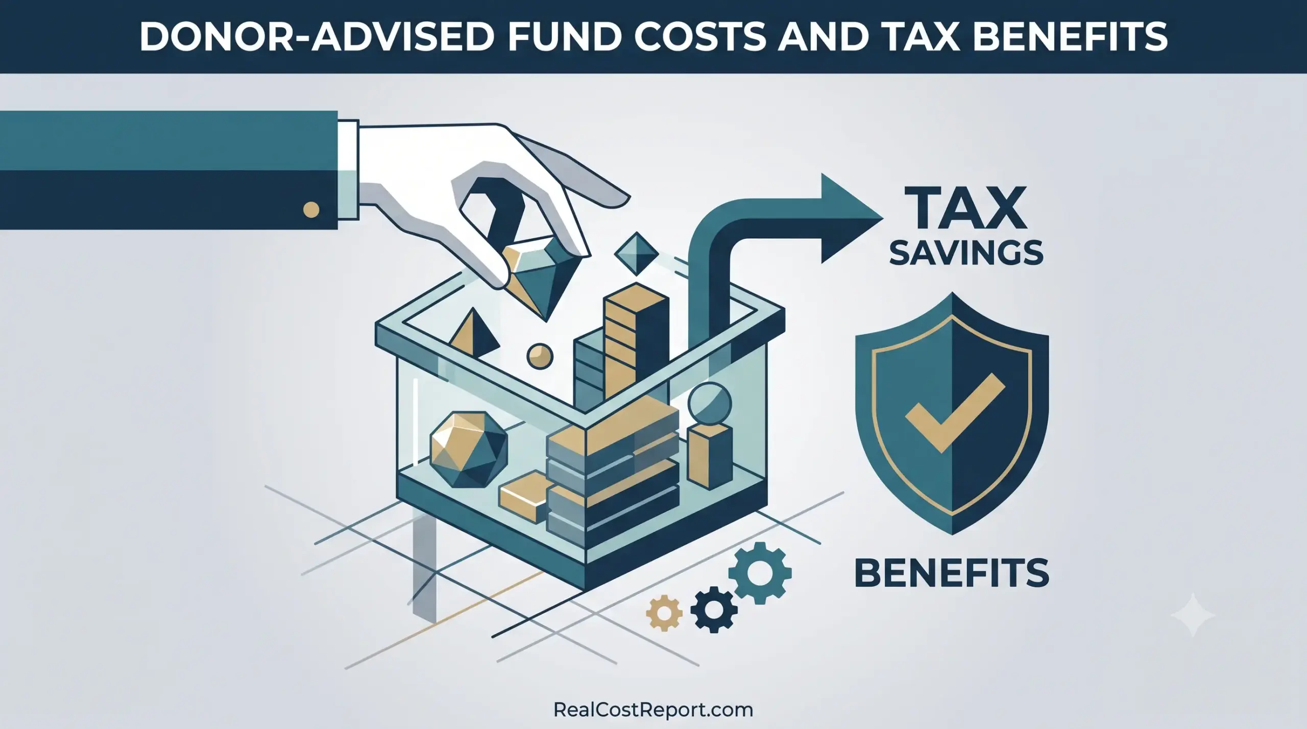
Geometric vector illustration of a hand depositing assets into a structured fund, creating tax savings and benefits.

Donor-Advised Fund Costs and Tax Benefits: What They Really Cost in 2026

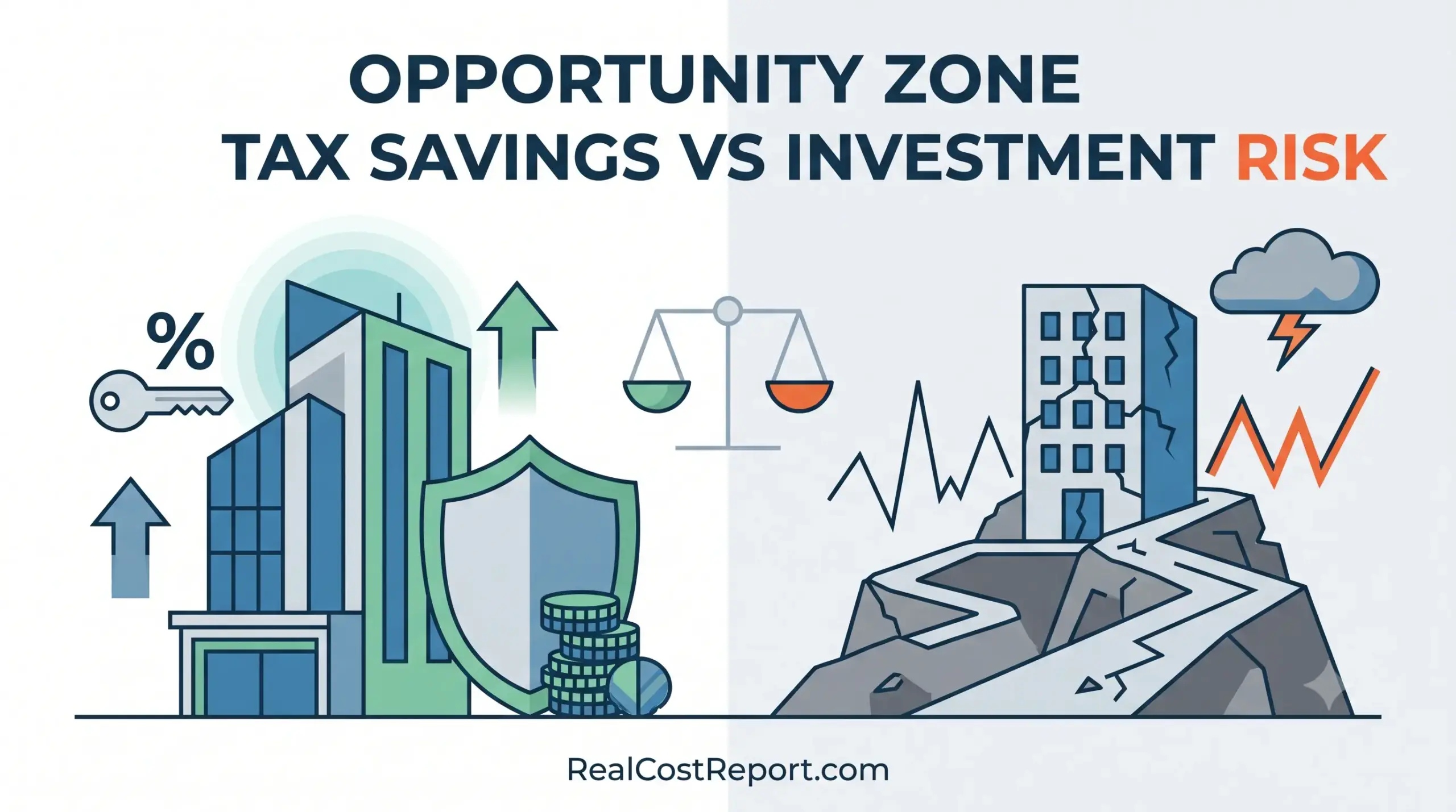
A geometric vector illustration with a split composition, showing stable modern buildings on one side and crumbling real estate on the other, comparing tax savings with investment risks.

Opportunity Zone Tax Savings vs Investment Risk: Is It Worth It in 2026?

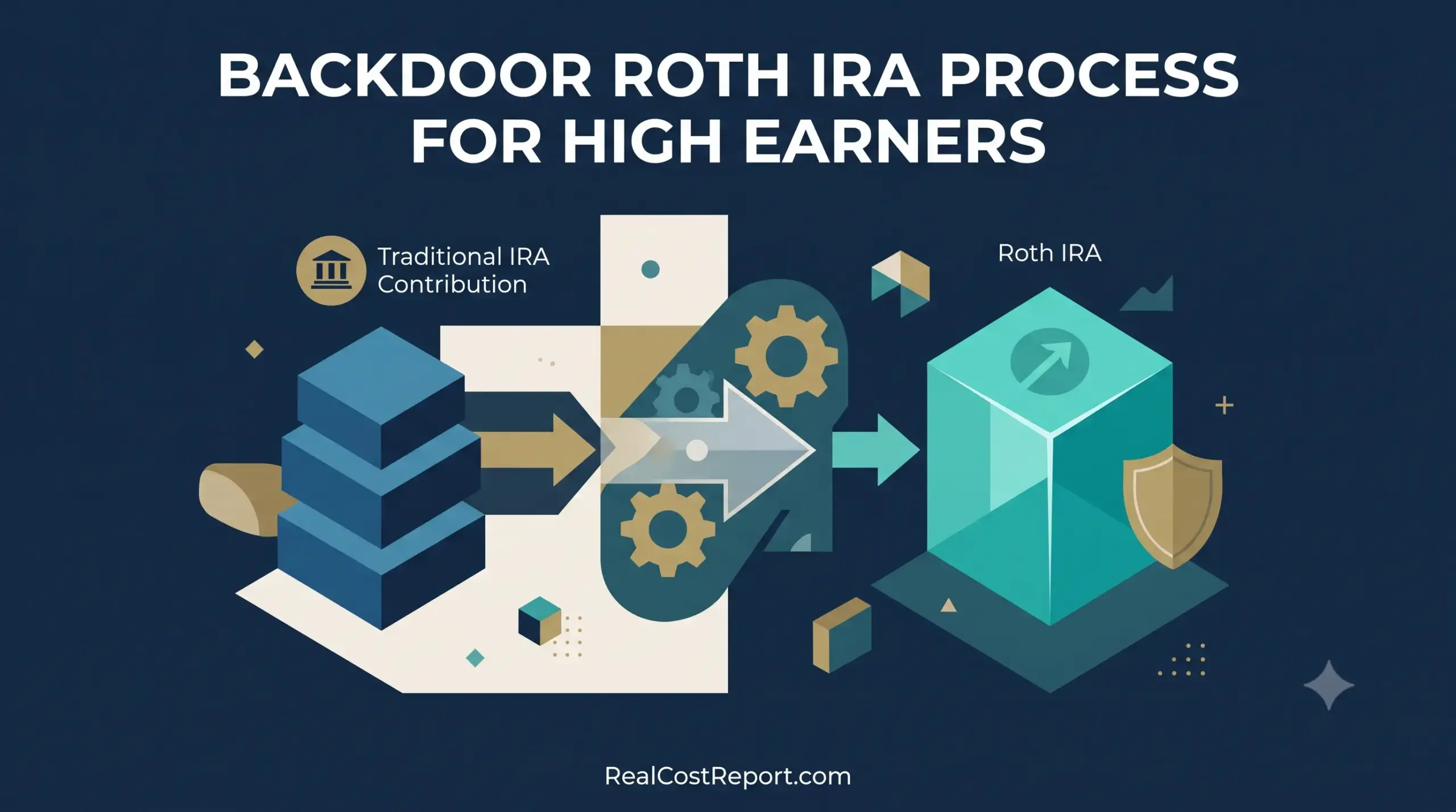
A geometric vector illustration showing a conversion process from a Traditional IRA stack to a Roth IRA cube with a growth arrow.

The Backdoor Roth IRA in 2026: How Much It Costs High Earners and Is It Worth It

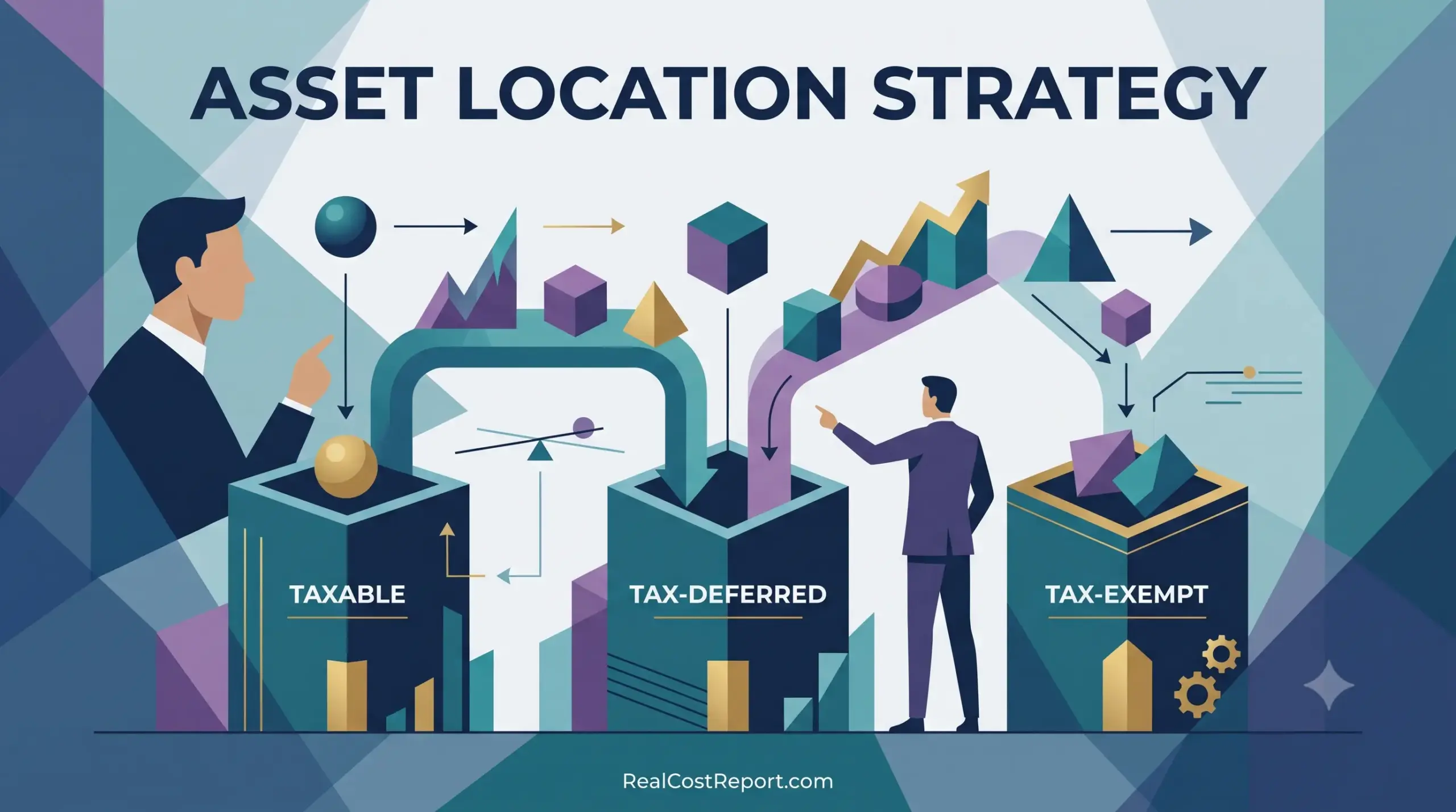
Geometric vector illustration of advisors placing assets into taxable, tax-deferred, and tax-exempt containers with the title ASSET LOCATION STRATEGY.

Asset Location Strategy in 2026: How Much It’s Really Worth Across Account Types

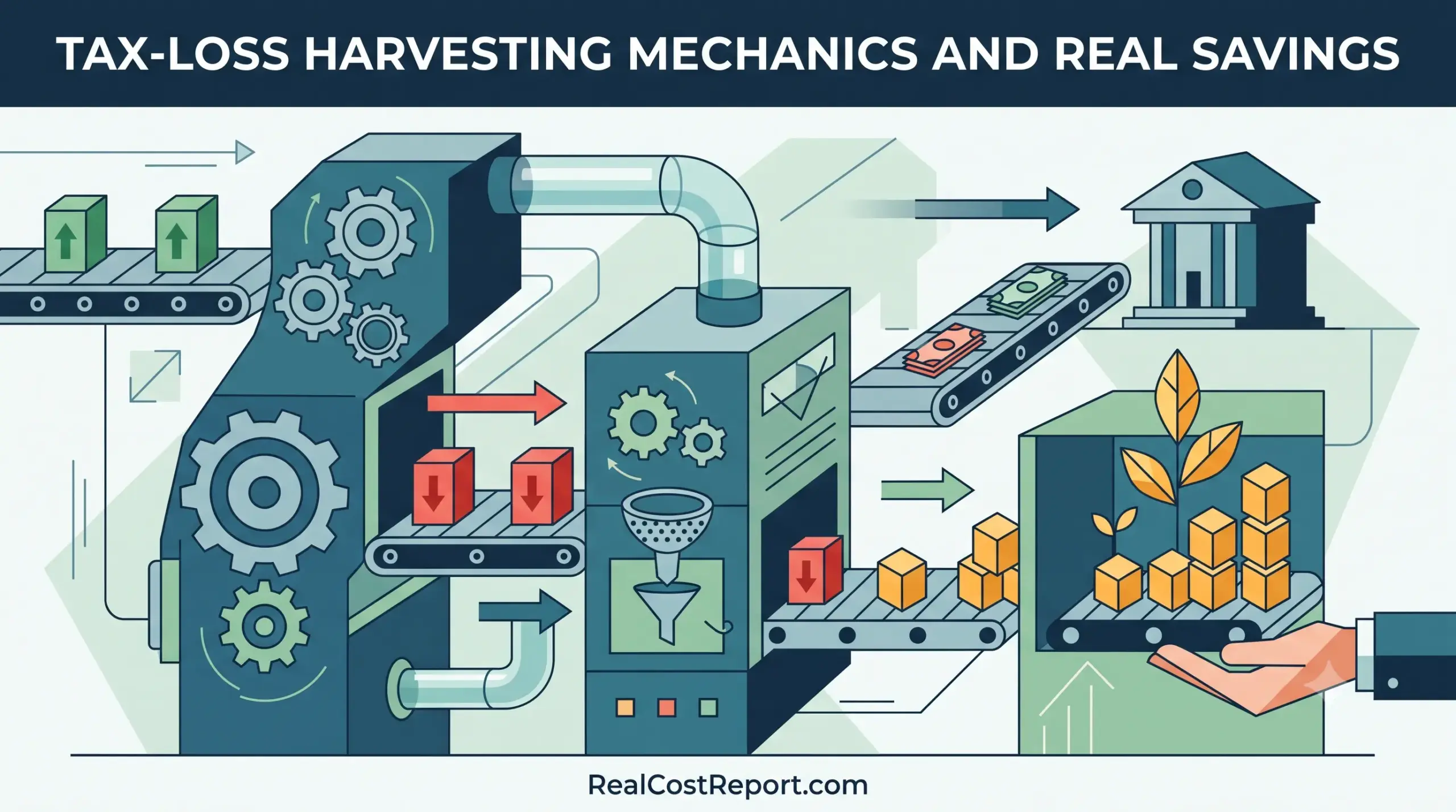
Geometric vector illustration of a mechanical system processing investment arrows into geometric plants and money stacks.

Tax-Loss Harvesting in 2026: How Much It Actually Saves You

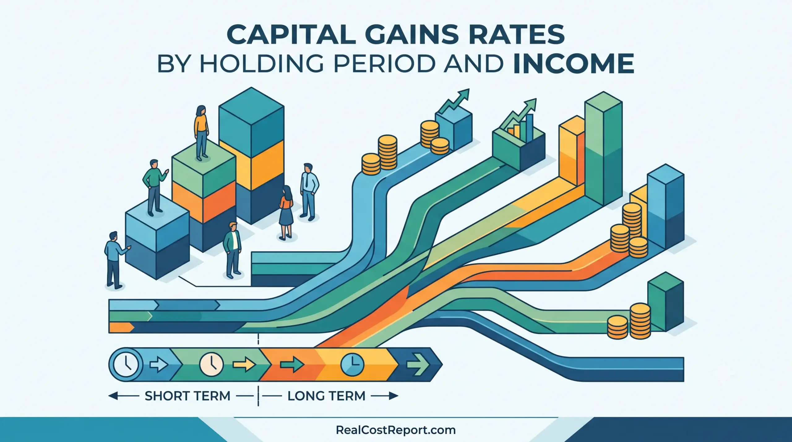
An isometric illustration with charts and paths, titled 'CAPITAL GAINS RATES BY HOLDING PERIOD AND INCOME'.

Capital Gains Tax Rates 2026: How Holding Period and Income Set Your 0%, 15%, or 20% Bill

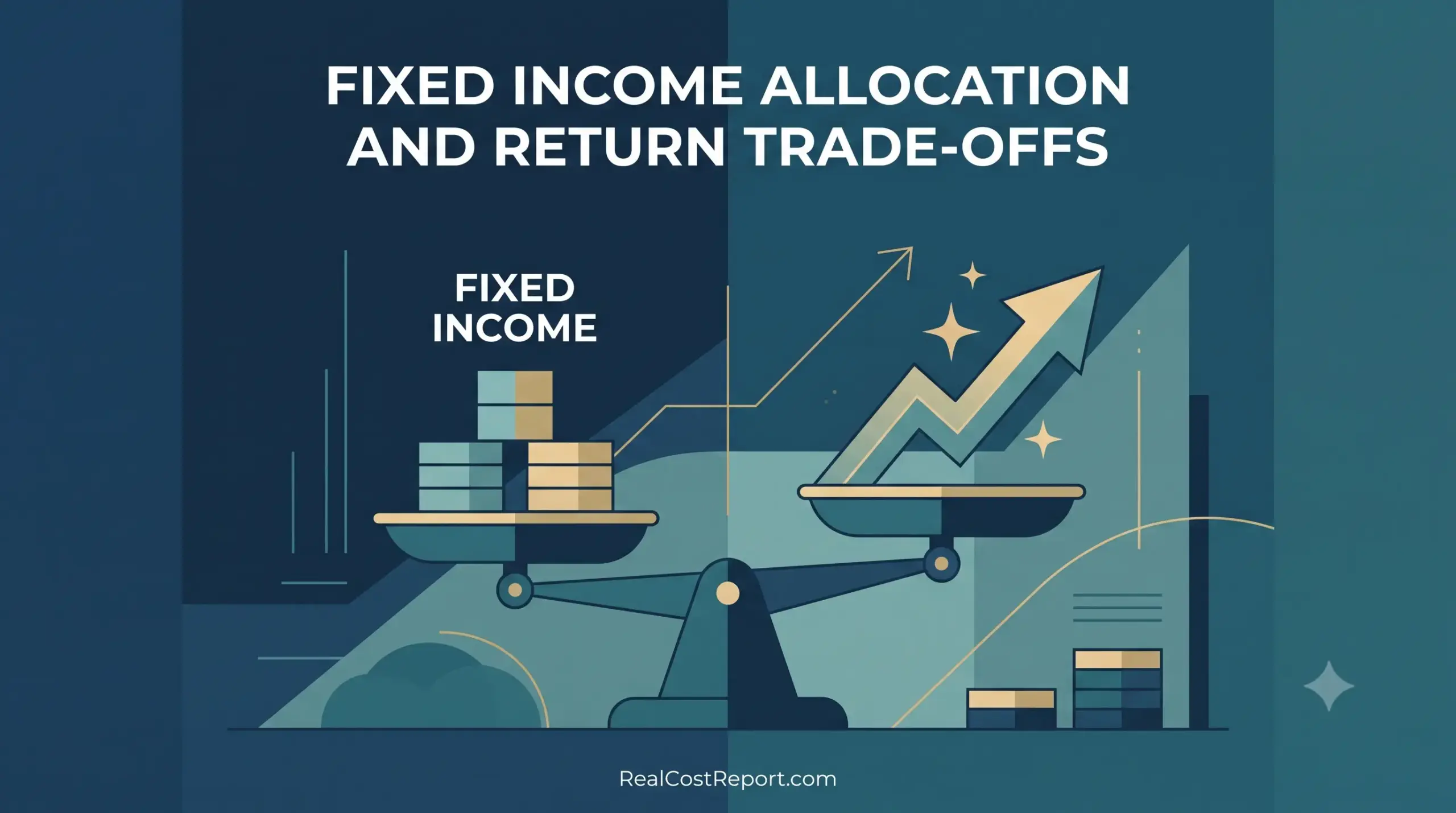
A balanced scale weighing coins against an arrow, illustrating fixed income allocation and return trade-offs.

Fixed Income Allocation in 2026: How Much Bond Exposure Is Worth It vs. Stocks?

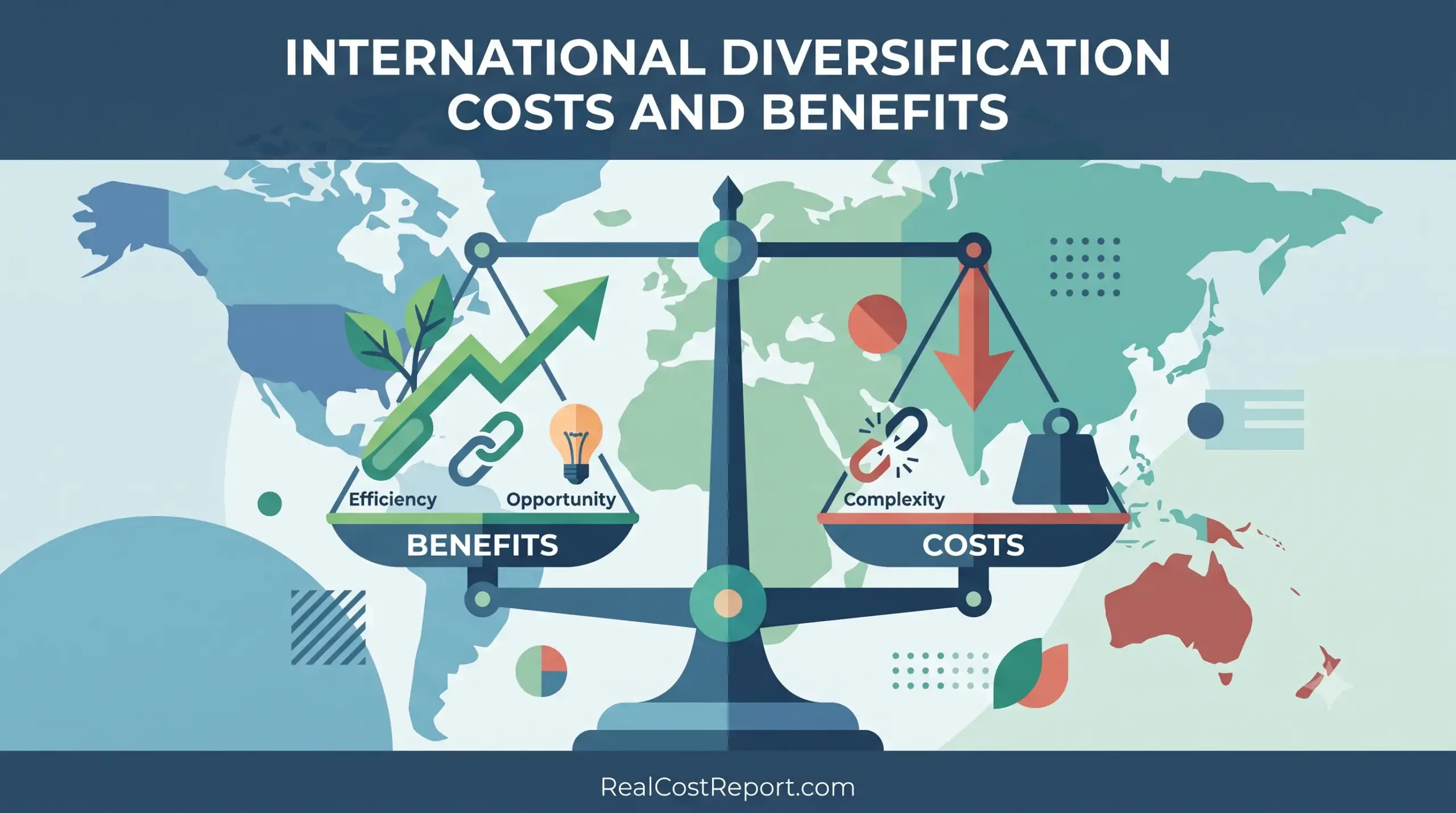
A minimal vector illustration featuring a world map and a large scale comparing the benefits and costs of international diversification.

International Diversification in 2026: What It Really Costs and Whether It’s Worth It

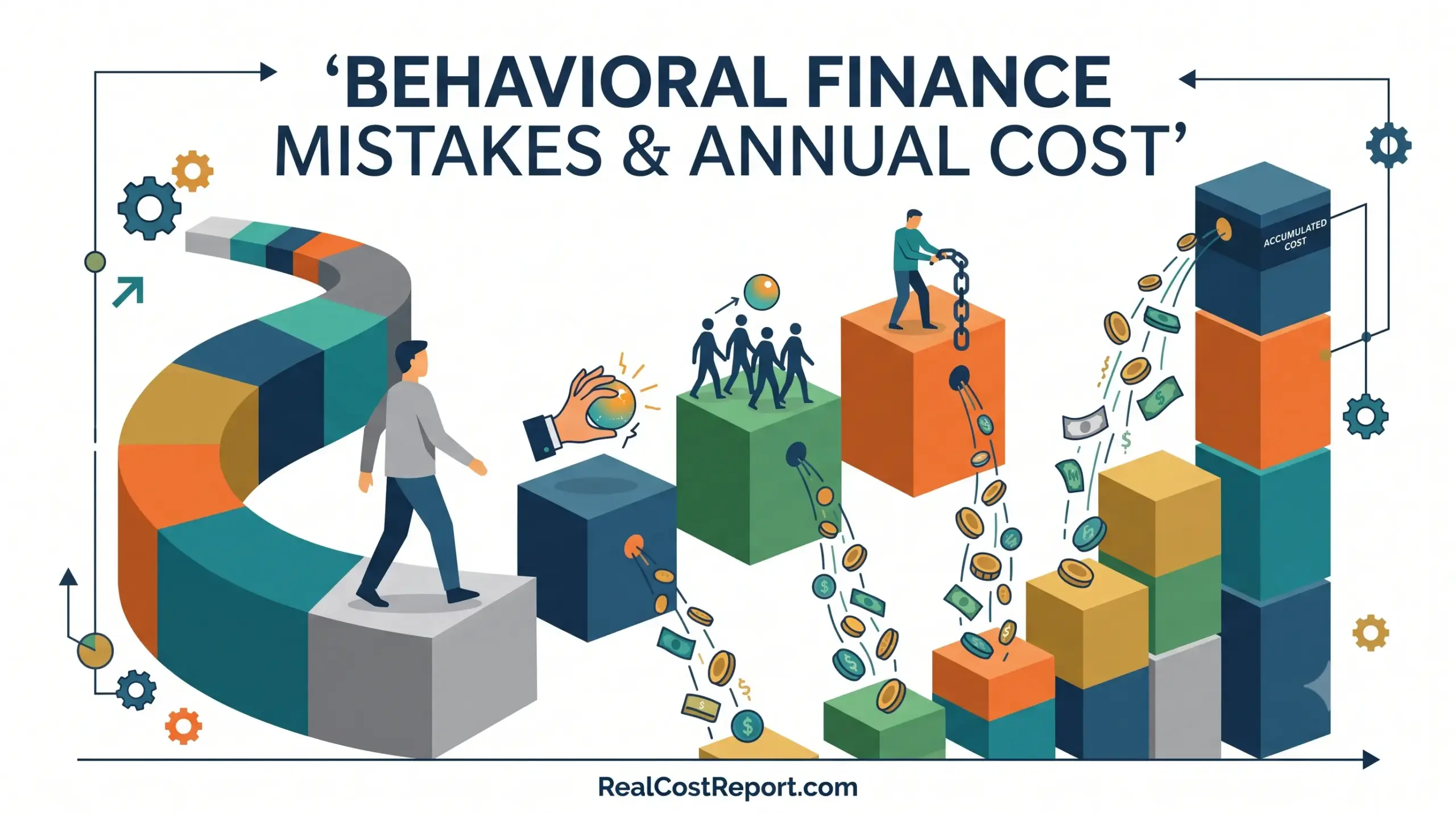
A modern geometric illustration visualizing behavioural finance pitfalls leading to accumulating annual costs along a winding investment path.

Behavioral Finance Mistakes: What They Really Cost You Per Year (2026 Guide)

Geometric illustration of gears, an upward arrow, and a star below the headline Target-Date Fund Costs.

Target-Date Fund Costs in 2026: Is the Convenience Worth It? (Vanguard vs. Fidelity vs. Schwab)

Minimal geometric illustration showing abstract block comparisons representing fund expense ratios, featuring the article title and website URL.

Expense Ratio Comparison Across Fund Providers: Vanguard vs Fidelity vs Schwab (2026)

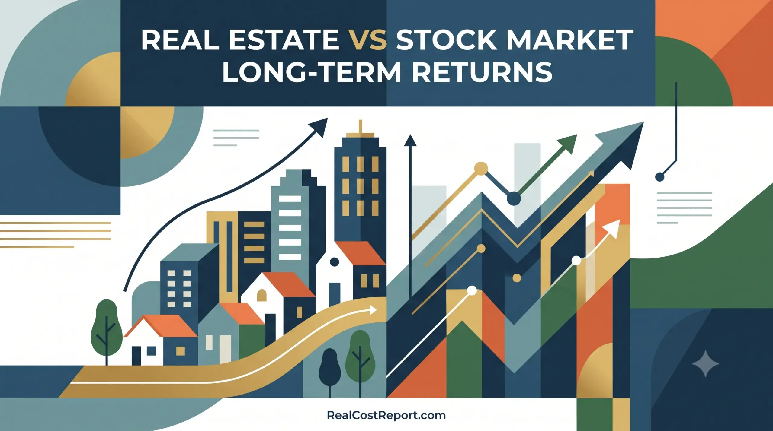
A geometric vector illustration contrasting rising real estate values on the left with a bull market stock chart on the right.

Real Estate vs. Stock Market Long-Term Returns (2026): Which Actually Builds More Wealth?

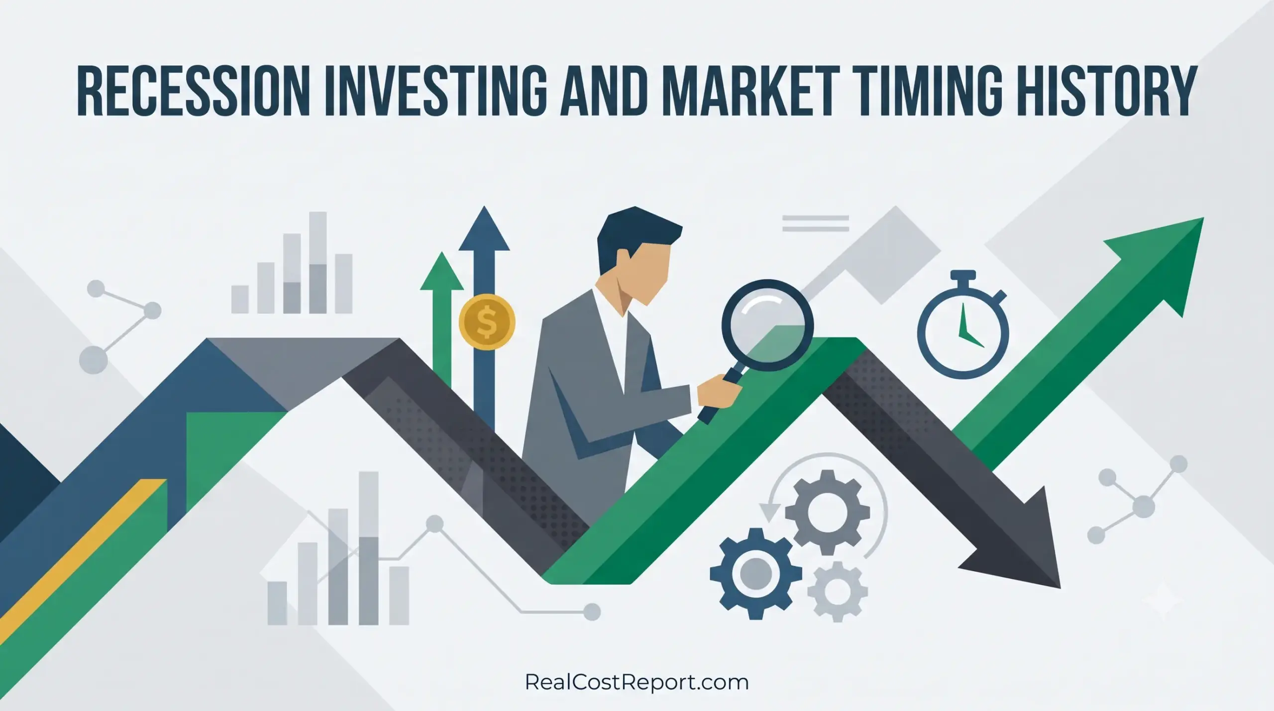
Flat vector illustration of a man with magnifying glass analyzing a fluctuating market arrow with clock and gear icons.

Recession Investing and Market Timing: What 172 Years of History Actually Cost (2026 Guide)

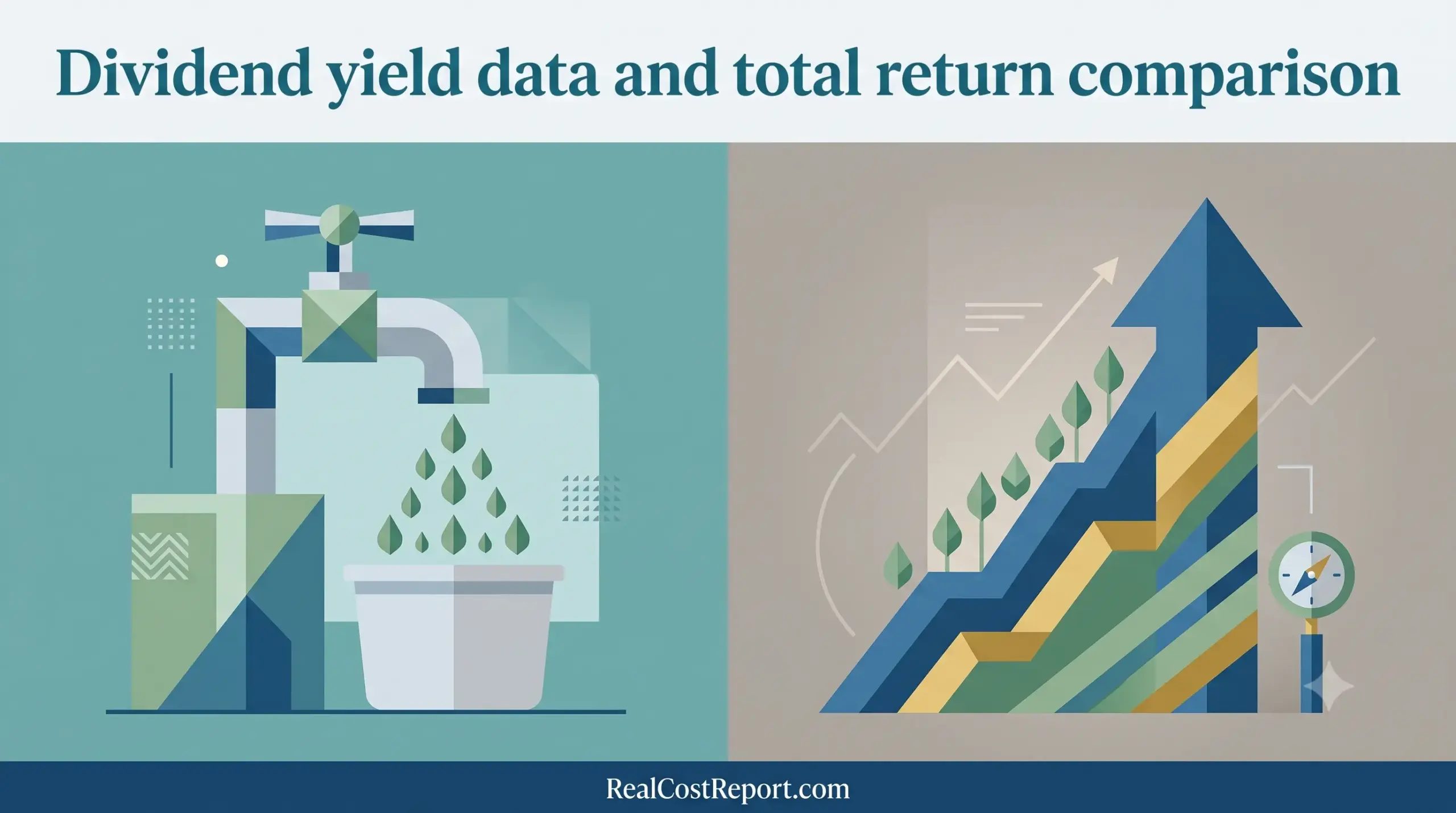
A modern vector illustration dividing two financial concepts: passive income generation and total compound growth with reinvestment.

Dividend Yield vs Total Return 2026: How Much Dividends Really Add to S&P 500 Gains

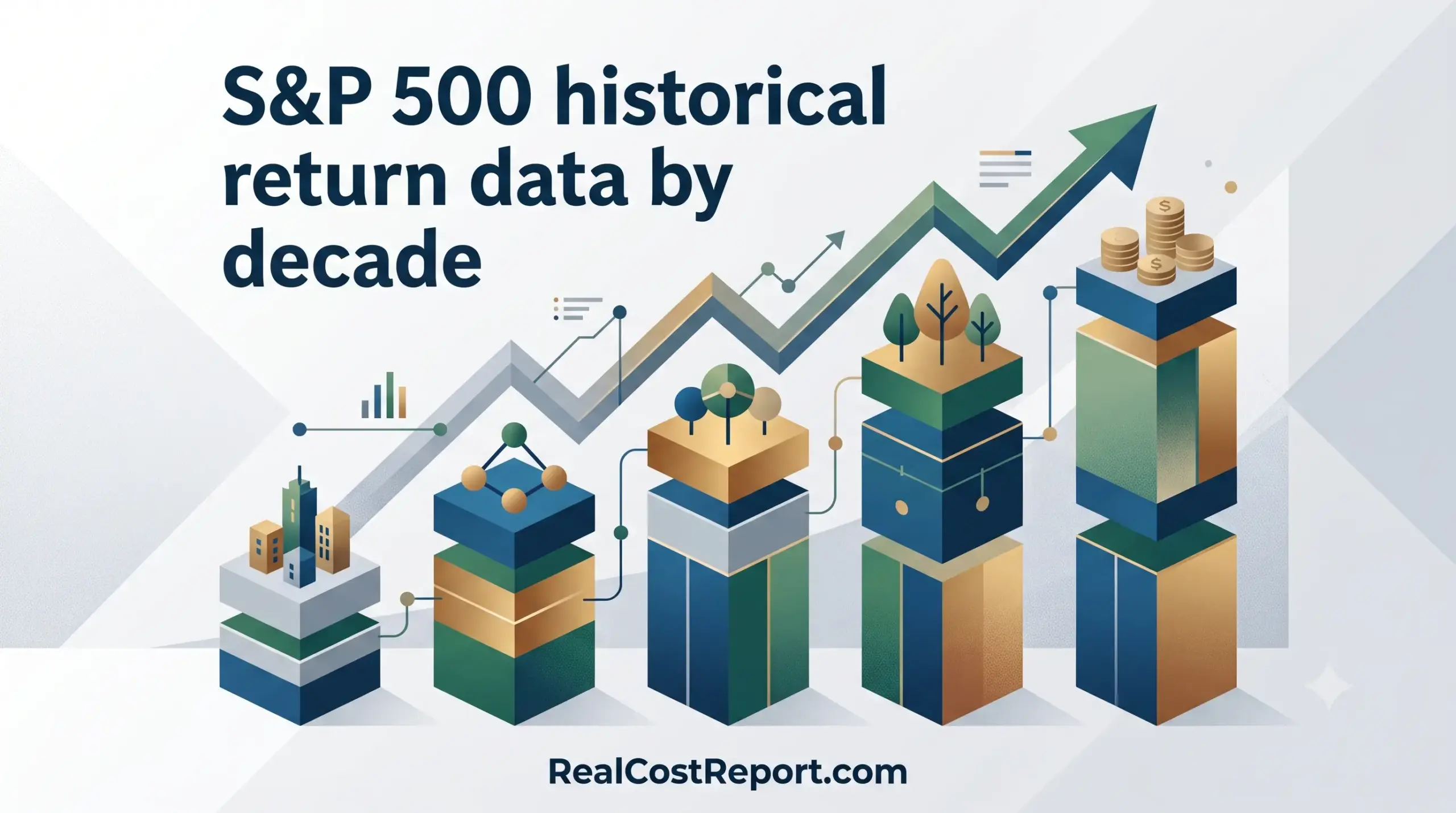
A geometric vector illustration shows an upward-trending bar chart with cities, network nodes, trees, and coins, titled 'S&P 500 historical return data by decade'.

S&P 500 Returns by Decade (2026): Historical Data, Real vs Nominal, and What It Means for Your Portfolio
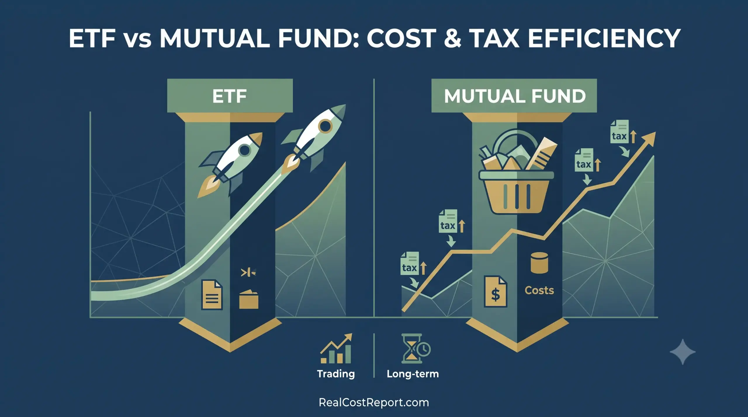
A split geometric vector graphic comparing ETF and mutual fund growth, costs, and tax symbols for analysis.

ETF vs Mutual Fund Cost and Tax Efficiency: 2026 Guide to What You Actually Pay

Older posts
Newer posts
← Previous Page1 Page2 Page3 Page4 Next →
  • About Us
  • Editorial Policy
  • Methodology
  • Privacy Policy
  • Terms of Use
  • Contact Us
© 2026 Real Cost Report. All Rights Reserved.