Skip to content
Real Cost Report
  • Legal
  • Insurance
  • Mortgage
  • Loans
  • Investing
  • Healthcare
  • Business
  • Estate Planning
Real Cost Report
Real Cost Report
  • Legal
  • Insurance
  • Mortgage
  • Loans
  • Investing
  • Healthcare
  • Business
  • Estate Planning

Investing

Compare advisor fees, expense ratios, and retirement account strategies. SEC EDGAR and FINRA BrokerCheck verified data.

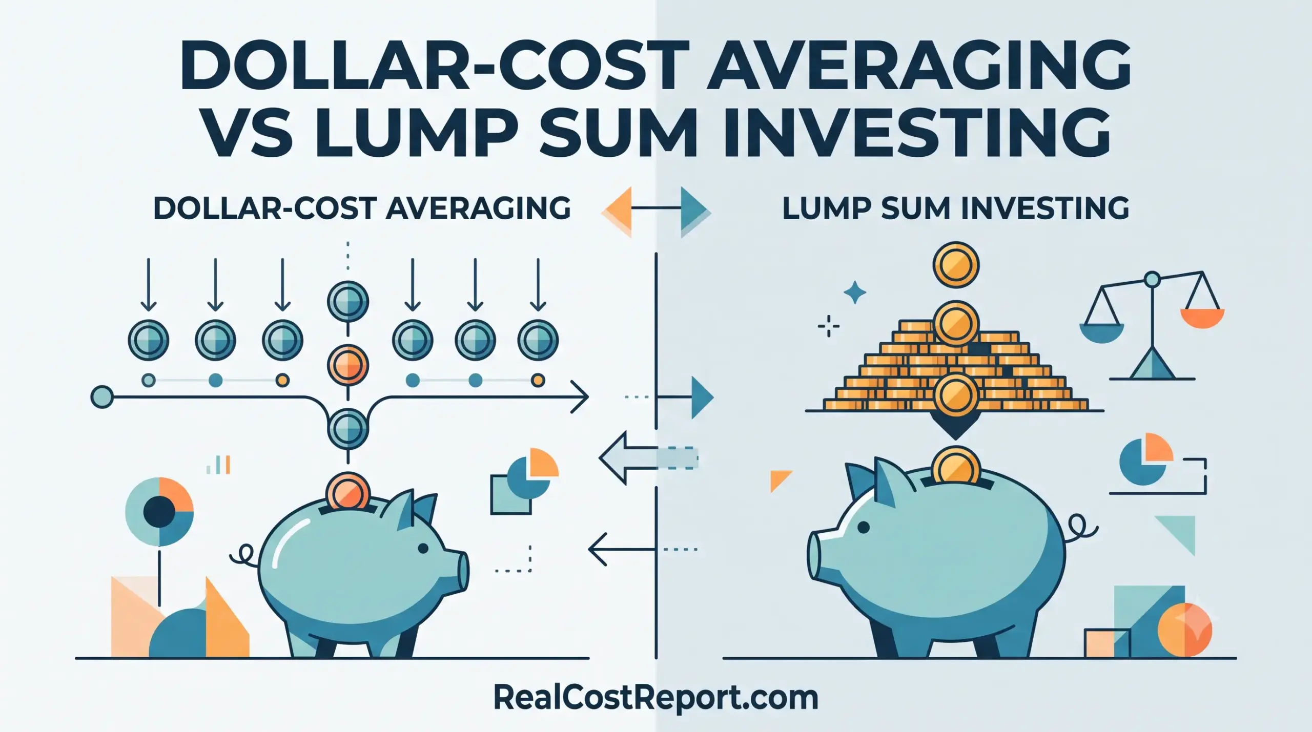
A modern vector illustration comparing a steady stream of investments (DCA) and a single large deposit (Lump Sum) into piggy banks.

Dollar-Cost Averaging vs Lump Sum Investing: Which Wins in 2026?

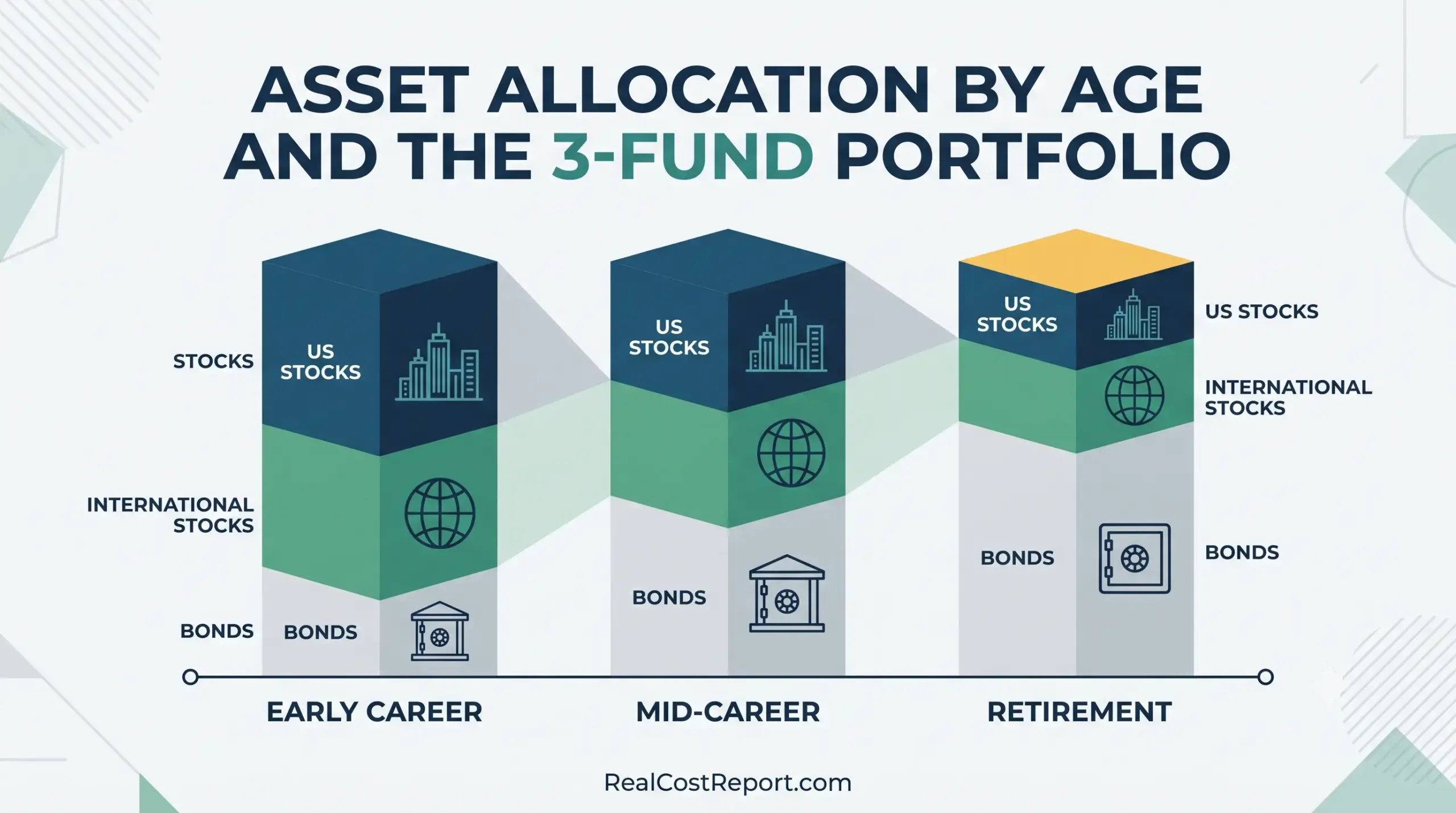
A clean vector diagram showing asset allocation shifting from stocks to bonds through three career stages: Early, Mid, and Retirement.

Asset Allocation by Age and the 3-Fund Portfolio: What It Really Costs in 2026

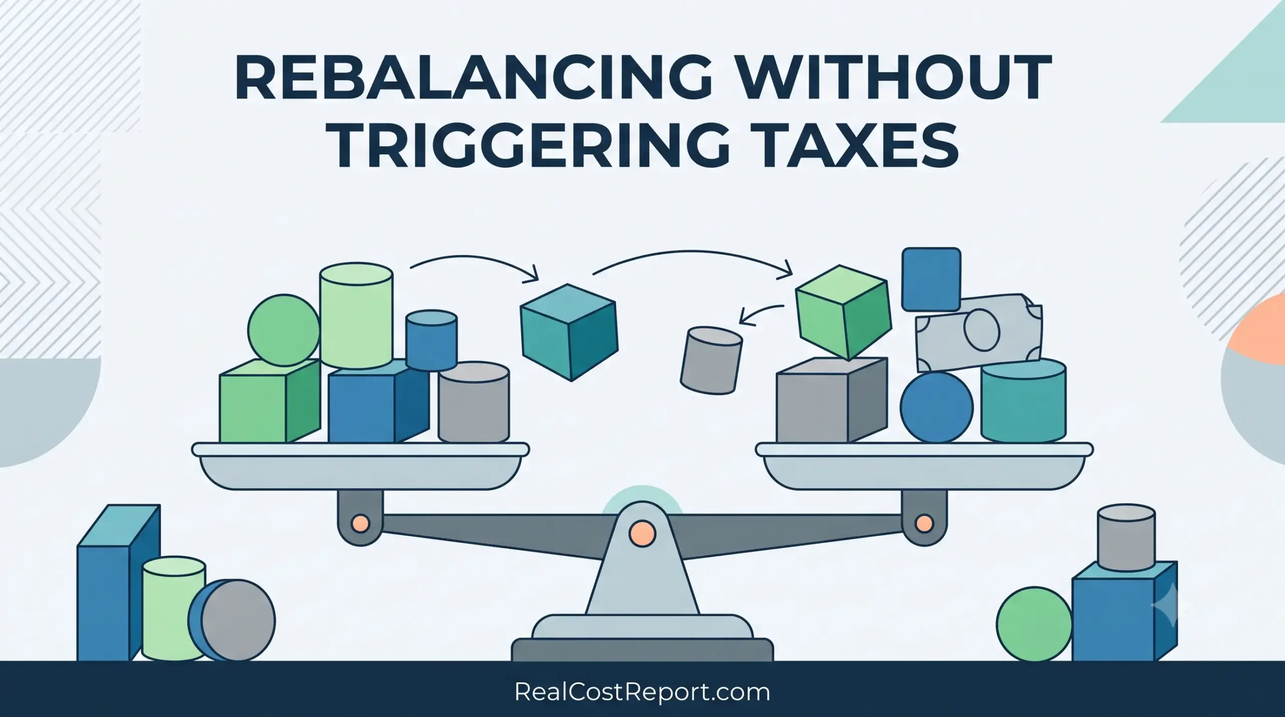
A modern geometric illustration showing a balance scale with shapes and money, symbolizing financial portfolio rebalancing.

Rebalancing Without Triggering Taxes in 2026: How Much It Actually Costs

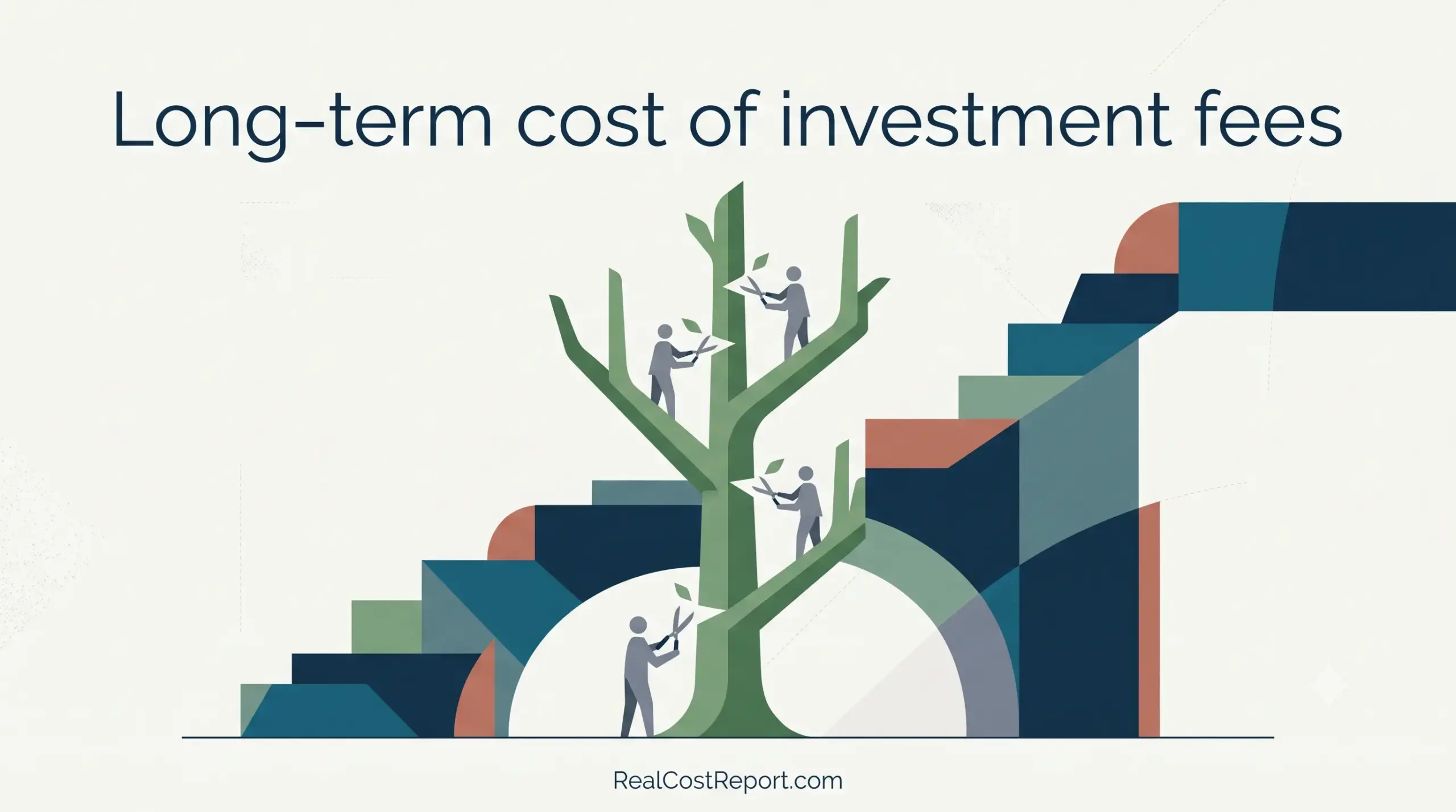
A clean geometric vector illustration showing figures pruning branches from a growing money tree, symbolizing the cost of investment fees.

The Long-Term Cost of Investment Fees in 2026: How Much a 1% Advisory Fee Really Costs

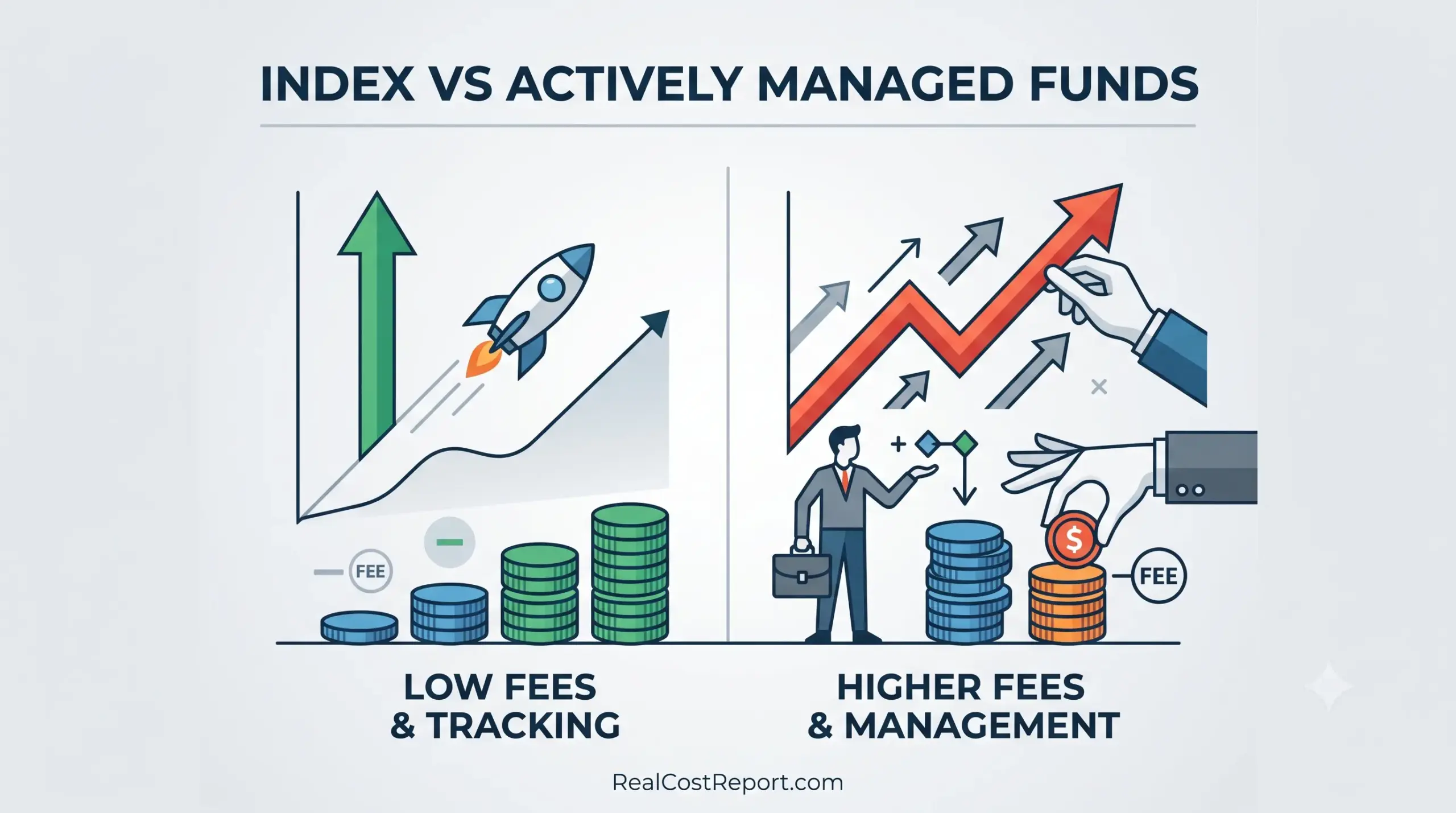
A minimalist vector illustration comparing the performance paths and fee structures of index versus actively managed funds.

Index vs Actively Managed Funds 2026: Fees, Performance, and What It Really Costs

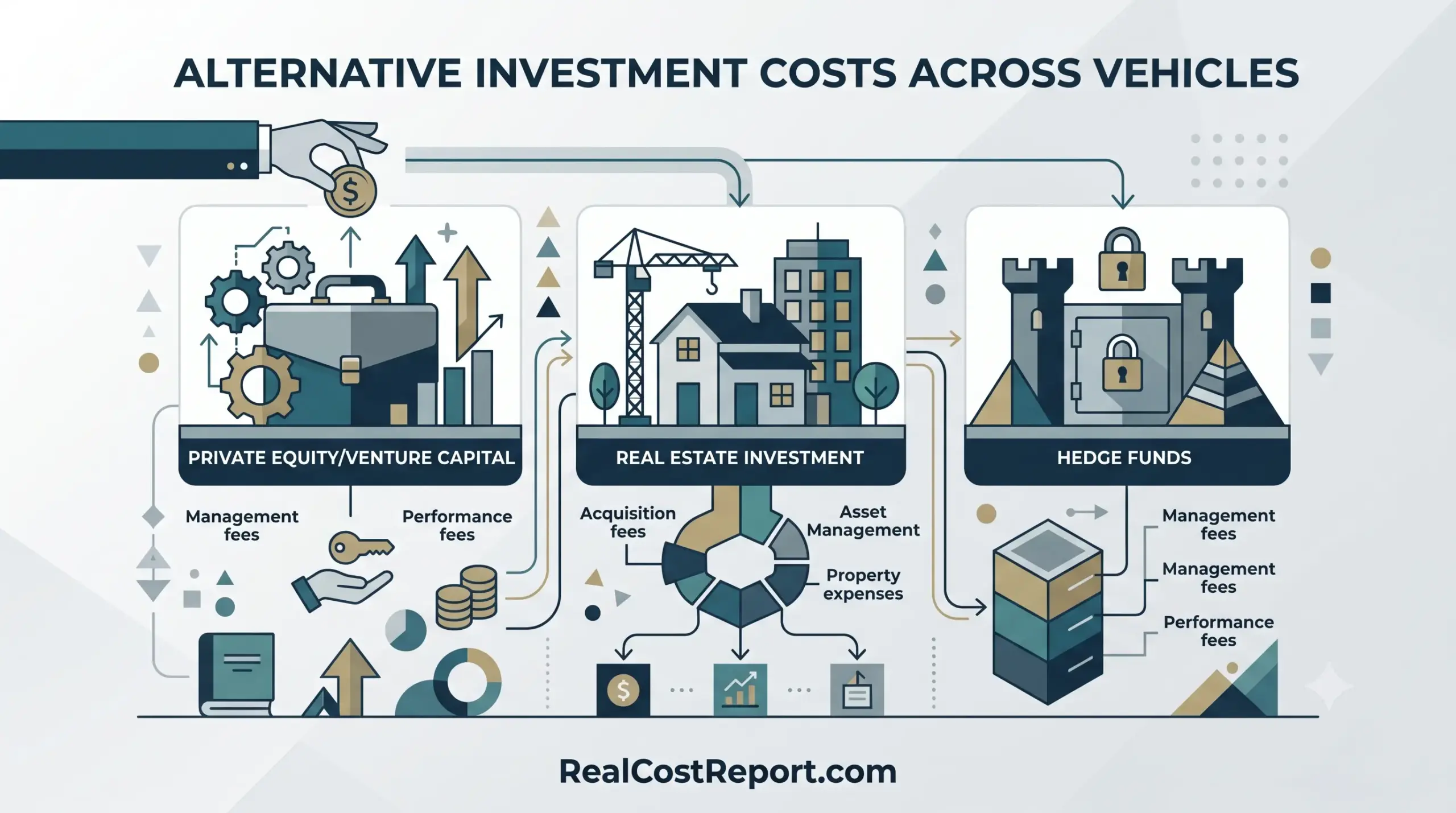
Alternative Investment Costs in 2026: Fee Comparison Across Every Vehicle (PE, Hedge Funds, REITs, Gold & Crypto)
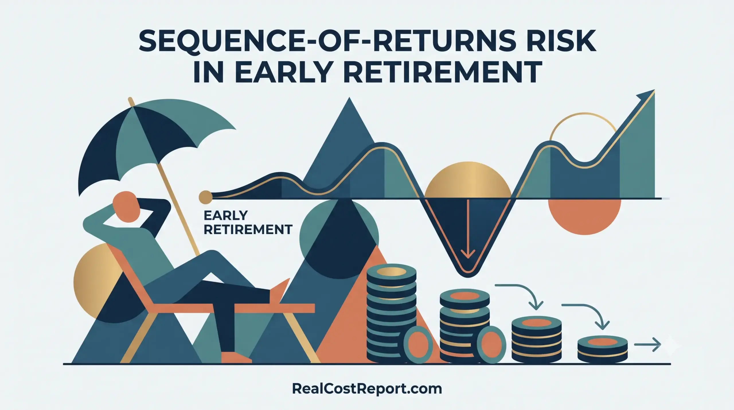
A geometric illustration shows a retiree watching a volatile market graph impact their diminishing stacks of gold coins.

Sequence-of-Returns Risk in Early Retirement: How Much It Actually Costs in 2026

Geometric illustration showing a balance scale weighing a hand holding money against a shield protecting a retired person and a piggy bank.

How Much Working Cuts Your Social Security in 2026: Earnings Test Cost Guide

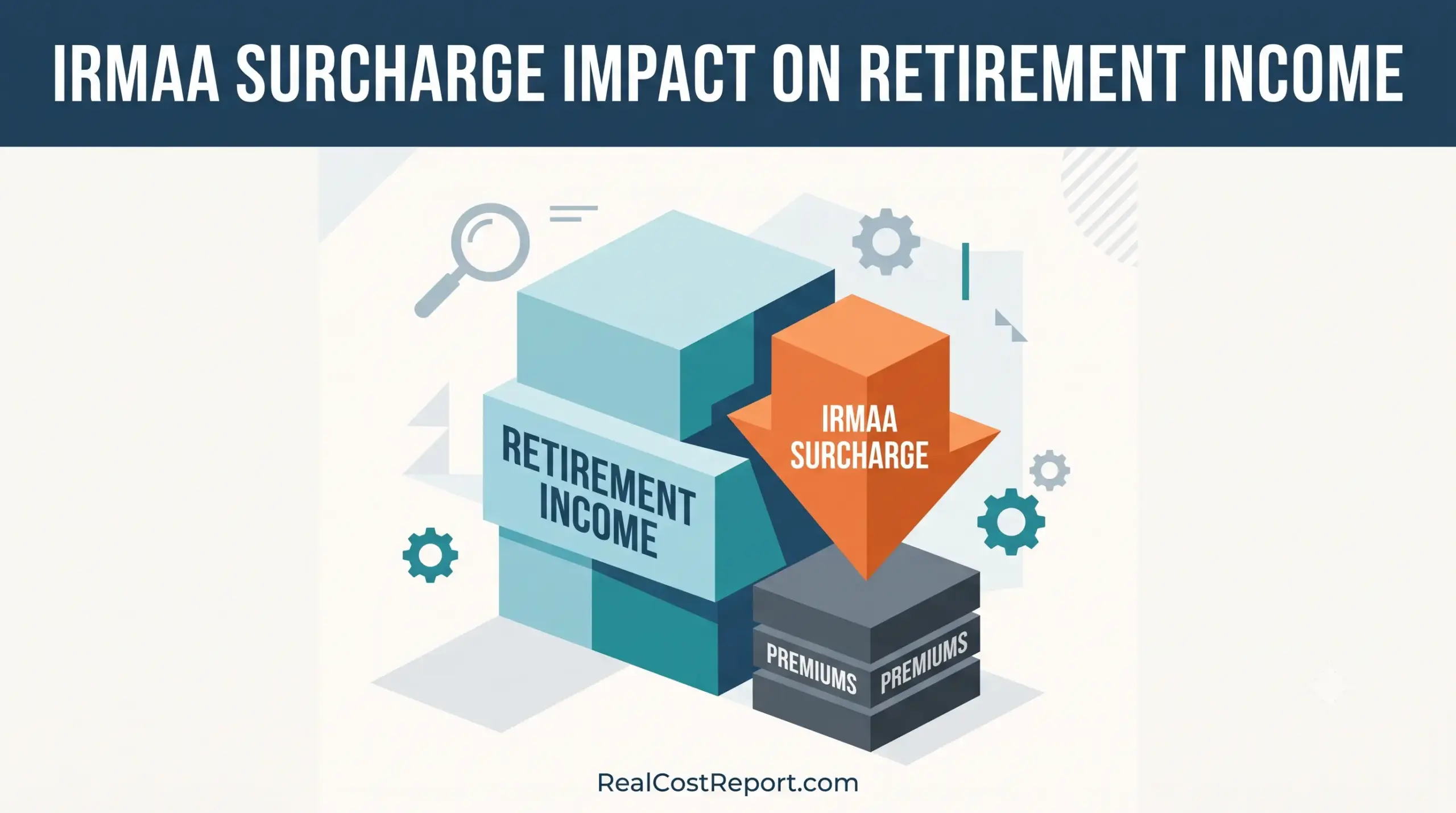
Geometric illustration showing an orange downward arrow representing an IRMAA surcharge pressing down on retirement income and premium blocks.

IRMAA Surcharge Impact on Retirement Income: How Much It Really Costs in 2026

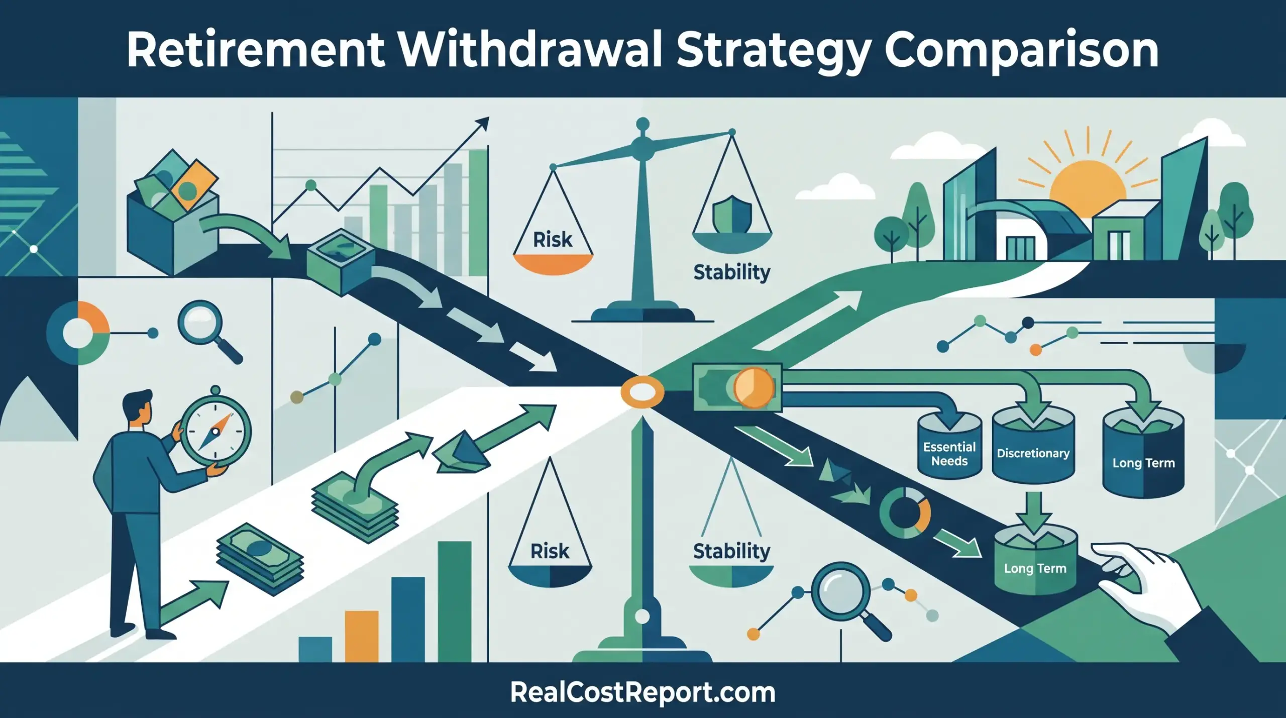
An intricate financial illustration comparing different retirement withdrawal paths, featuring a balance scale and labeled buckets, with the headline 'Retirement Withdrawal Strategy Comparison' and website URL.

Retirement Withdrawal Strategy Comparison 2026: Which Order Costs You Least?

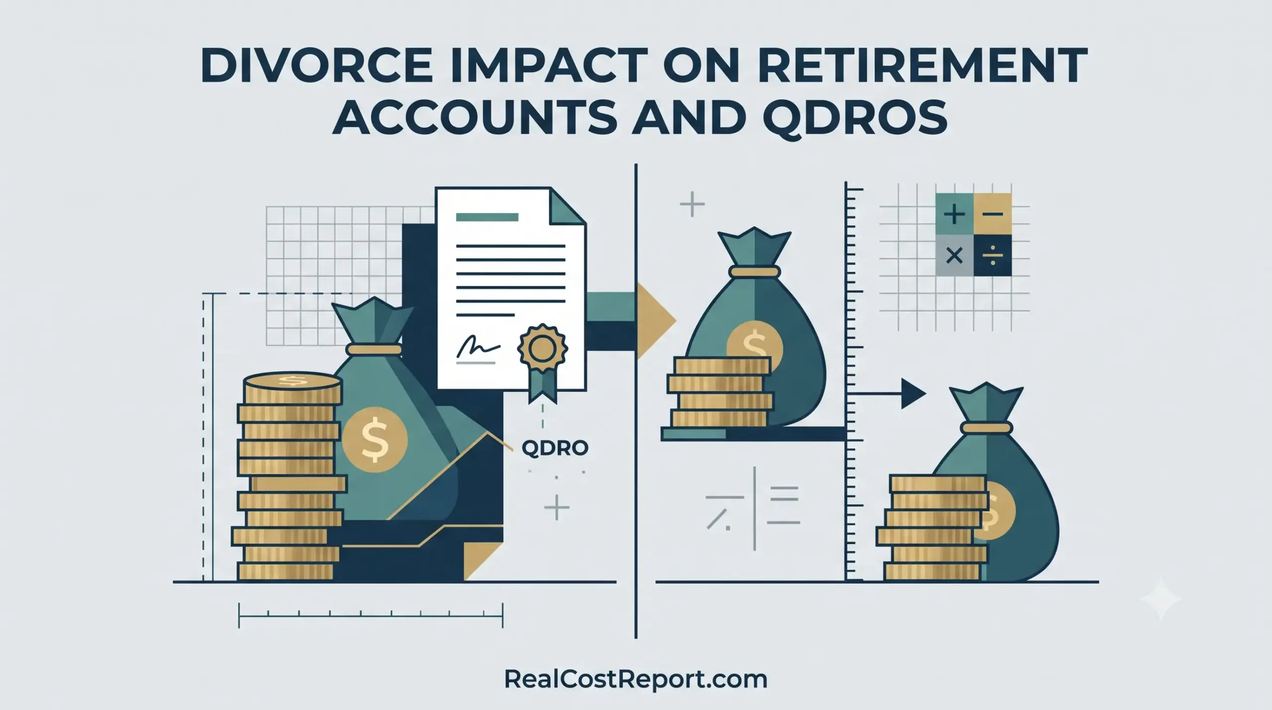
Geometric vector illustration showing a retirement fund split in two by a legal QDRO document after a divorce.

Divorce and Retirement Accounts: What a QDRO Really Costs in 2026

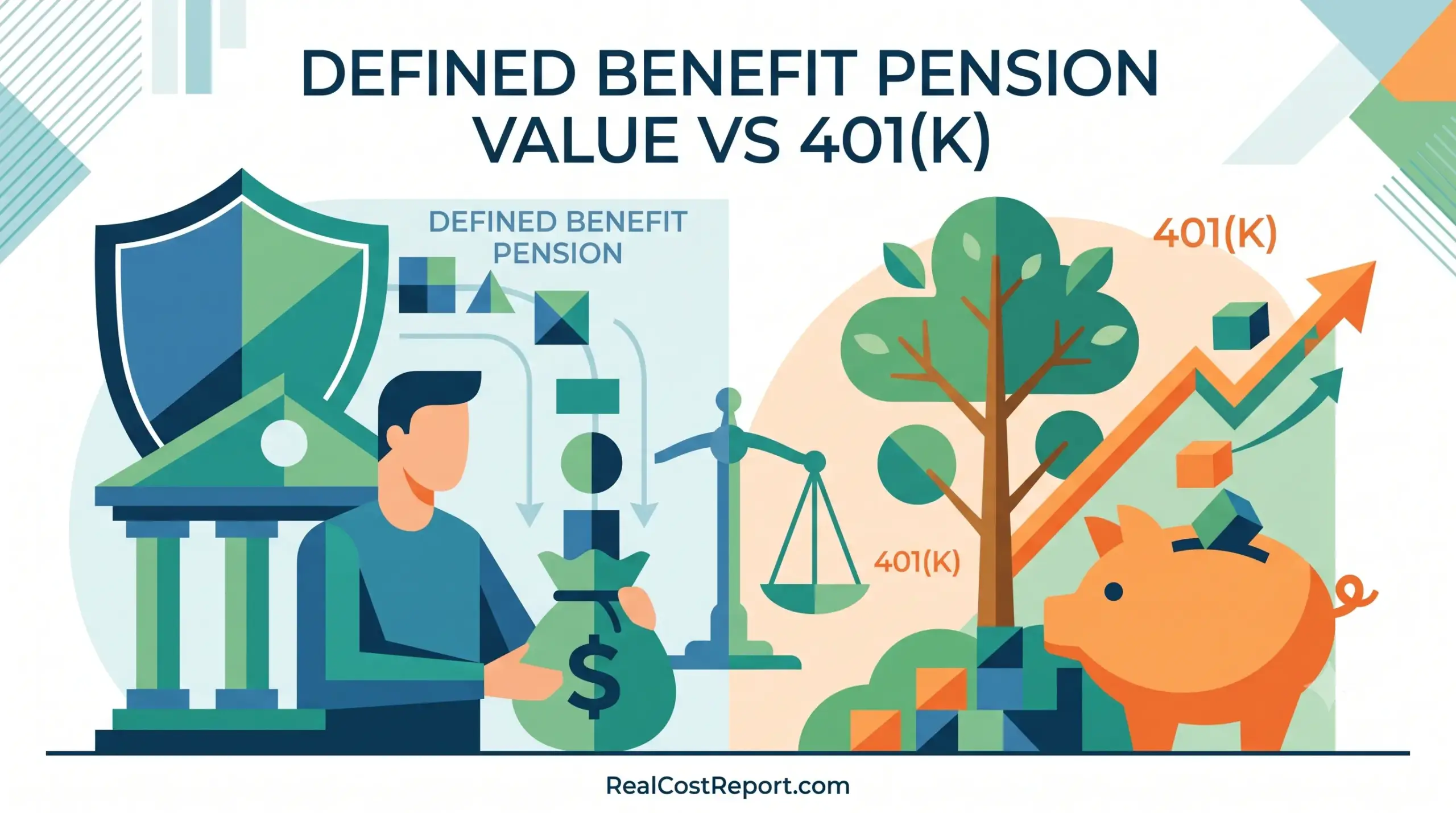
A professional vector illustration comparing defined benefit pensions, marked by a shield and bank, with 401(k) plans, featuring a tree and piggy bank.

Defined Benefit Pension Value vs 401(k): What a $60,000 Pension Is Actually Worth in 2026

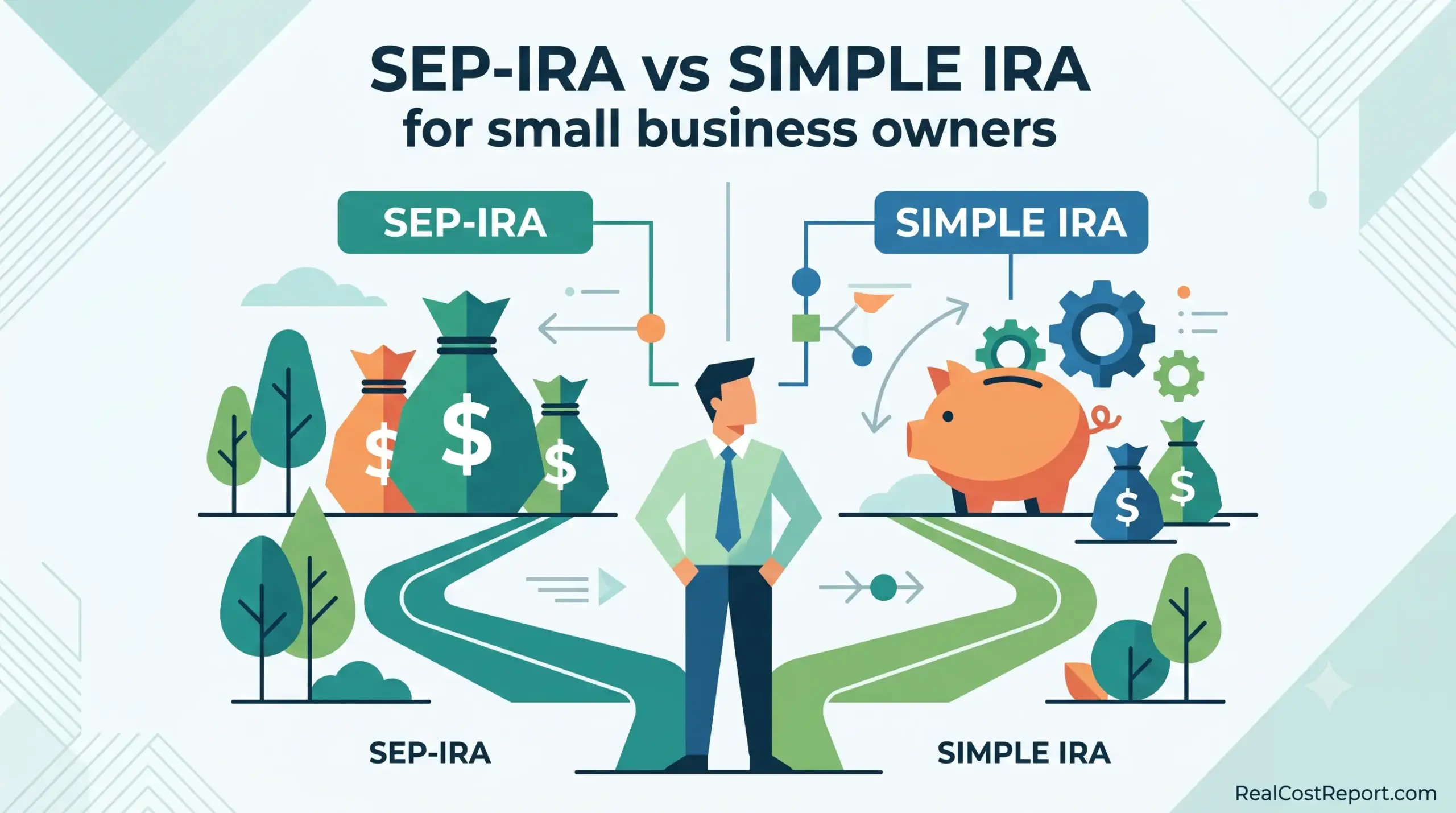
Geometric vector illustration comparing SEP-IRA and SIMPLE IRA options for small business owners with money bags, a piggy bank, and a central figure.

SEP-IRA vs SIMPLE IRA in 2026: Which Costs Small Business Owners Less?

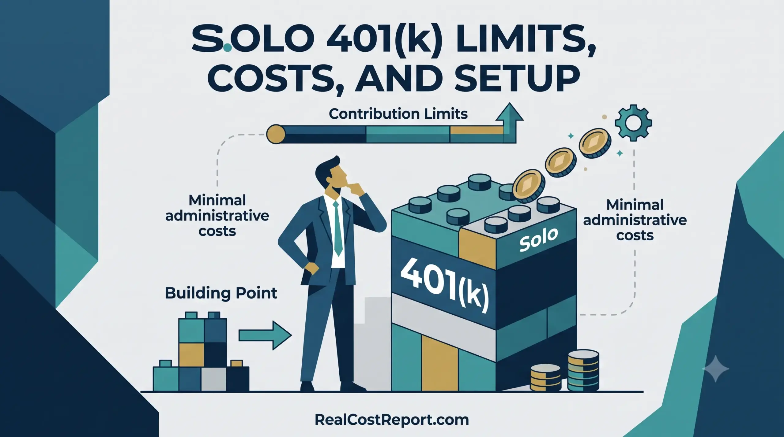
A business professional considers a 401(k) building block, illustrating setup steps, contribution limits, and minimal administrative costs.

Solo 401(k) 2026: How Much It Costs, the $72,000 Limit, and Setup Compared

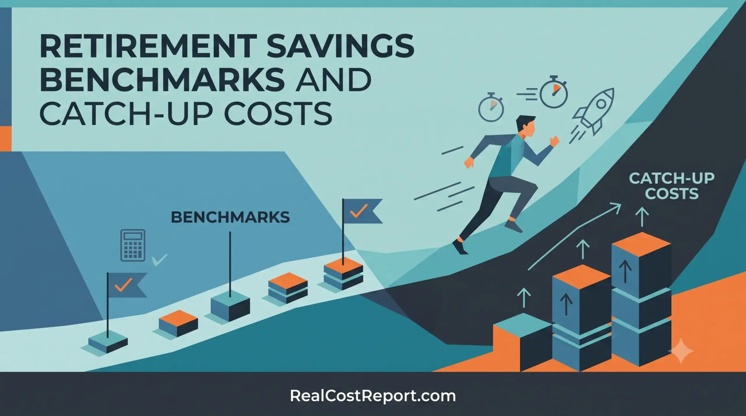
A flat design vector illustration featuring a business person running up steps towards a rocket, representing retirement catch-up costs.

Retirement Savings Benchmarks 2026: What Catch-Up Contributions Actually Cost

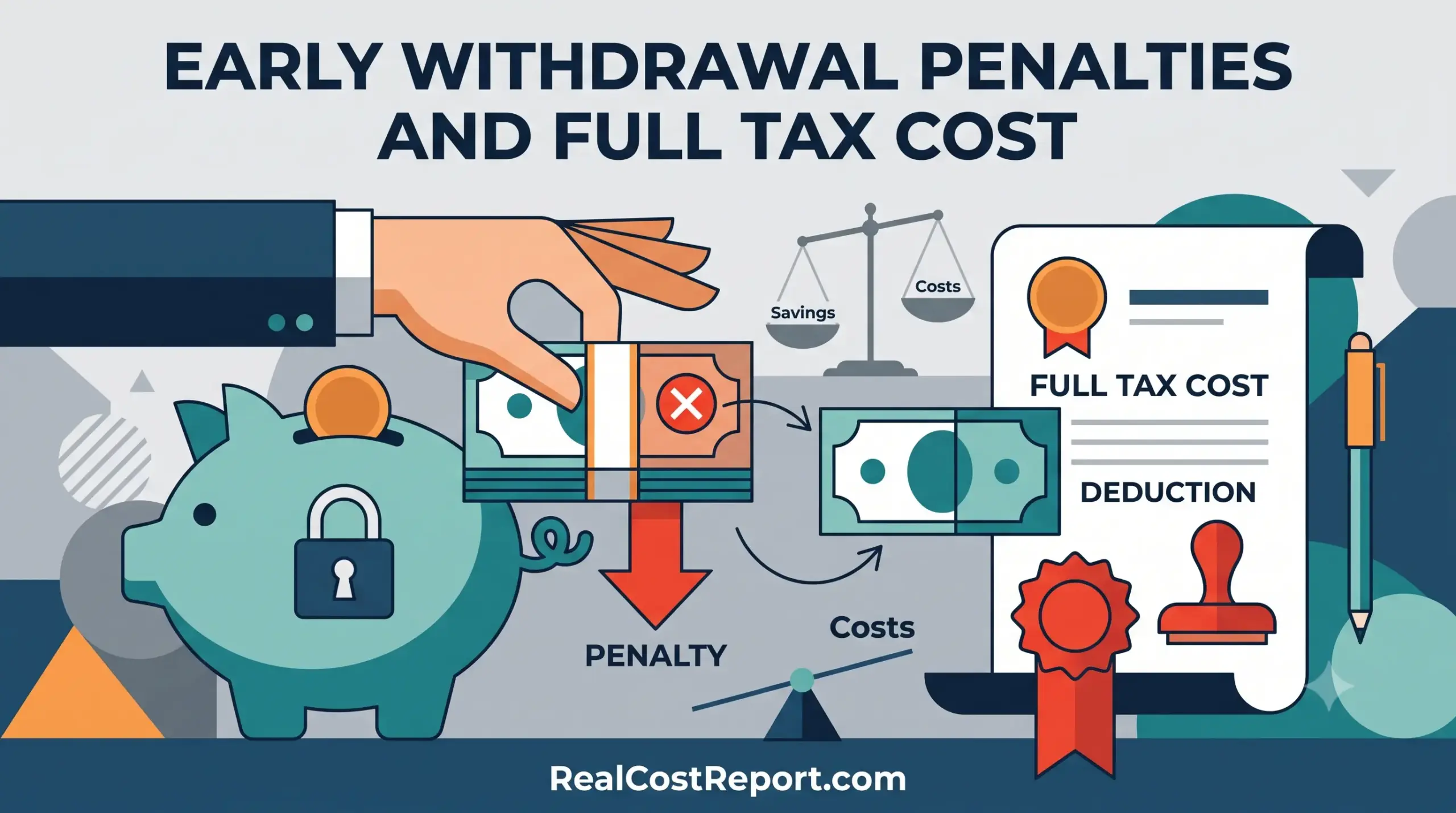
A vector illustration with the headline "Early withdrawal penalties and full tax cost." A hand removes cash from a locked piggy bank, labeled with a penalty arrow, alongside a tax cost document. RealCostReport.com is visible.

401(k) Early Withdrawal Penalty 2026: How Much a $50,000 Cash-Out Really Costs

A minimal geometric illustration of older adults beside an upward-trending block chart representing catch-up retirement contributions.

Catch-Up Contribution Limits After 50: How Much They’re Worth in 2026

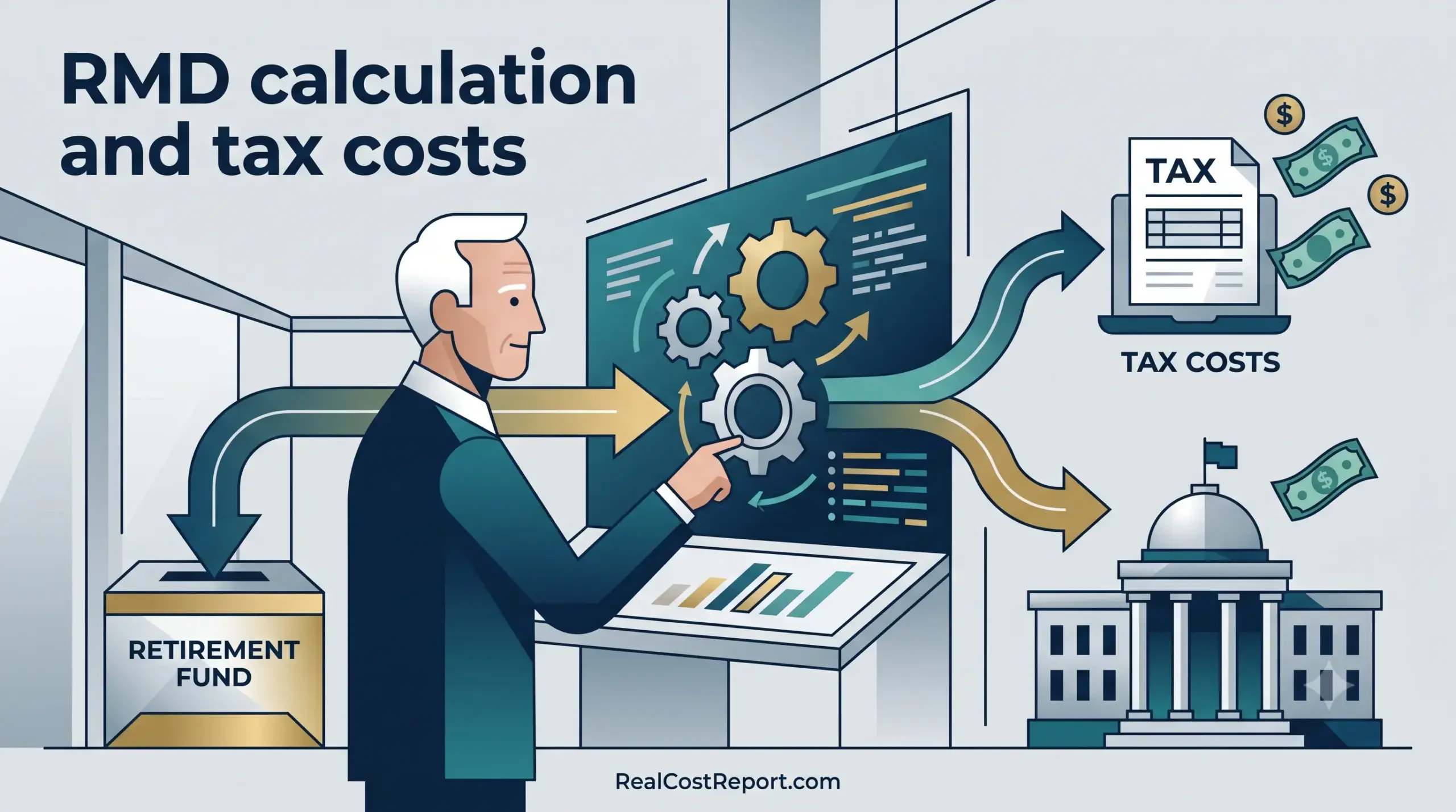
A vector illustration shows a man processing financial calculations that result in tax forms and government payments.

RMD Calculation and Tax Costs in 2026: How Much You Really Pay

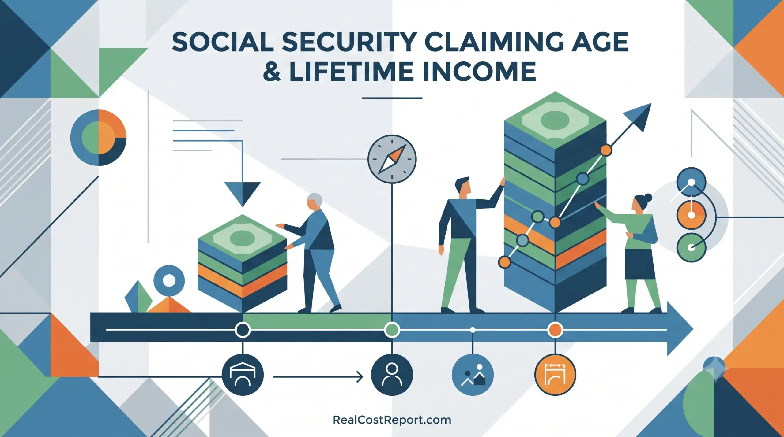
A geometric illustration showing how delaying social security claims can increase lifetime income, featuring a timeline and money stacks.

Social Security Claiming Age and Lifetime Income: What Waiting Until 70 Is Really Worth in 2026

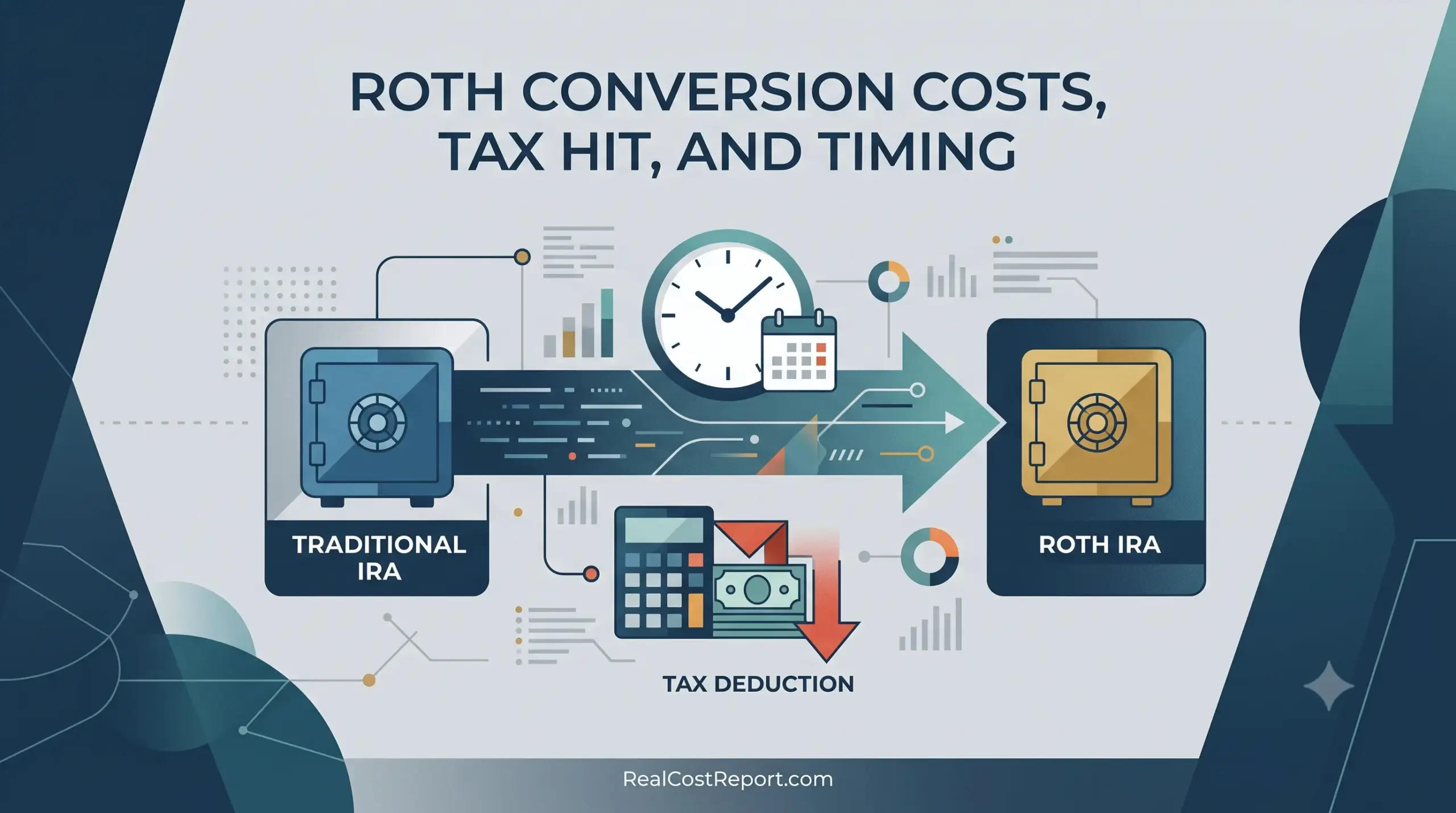
An infographic for "RealCostReport.com" about Roth conversion, showing a timeline, calculator, and vaults for Traditional and Roth IRAs.

Roth Conversion Costs in 2026: The Real Tax Hit and How Much Timing Saves

Older posts
Newer posts
← Previous Page1 Page2 Page3 Page4 Next →
  • About Us
  • Editorial Policy
  • Methodology
  • Privacy Policy
  • Terms of Use
  • Contact Us
© 2026 Real Cost Report. All Rights Reserved.